Figure to ground, grit and grain, and emotion.
CONQUER THE STREETS.

Conquer the streets with Henri PHANTOM BLACK.
Your New Street Photography Bag: SAIGON SATCHEL
Announcing SAIGON SATCHEL from HAPTICLABS: One of 18 in Existence. Sleek, Strong, and Innovative camera bag to accompany you on your future street photography adventures.
Figure to Ground: Contrast/separation between subject and background

The first principle of black and white photography: figure to ground.

Basic idea: clear separation between black and white, and white and black.
Basic figures
Some basic figures that illustrate the importance of clear separation between black and white:


Black and white as opponent colors

In color theory, the opposing colors create the strongest visual effect.
Therefore, consider the dramatic contrast or juxtaposition between black and white.
Also, the benefit of black and white in street photography is that it helps you simplify your pictures.

How does contrast and figure to ground lead your eyes?


Case study: Gaussian blur effect
To see whether your black and white pictures “work” or not, apply the Gaussian blur effect in Photoshop, to see whether you can clearly separate your subject and background.
For example, here is a silhouette of a woman behind a door which passes our “figure to ground test”:


The silhouette picture of the man at the lake also works:


Why does gritty, high contrast pictures look better?

Simple: having more contrast increases the “figure to ground” effect. Therefore, the good black and white pictures you make should be able to work when you crank the contrast and black slider to 100.
Therefore, I recommend download ERIC KIM PRESETS for the gritty, high contrast look.
Use a flash

Also to increase figure to ground, use a flash. This will create a higher contrast in your picture, and this create a more visually compelling black and white picture.

Why grain?

My theory: aesthetically, we prefer grain because the irregularity and texture of grain is related to the sense of touch. Humans love textured and “haptic” surfaces. This is why shooting gritty textures make for good photos.

When I shoot film, I use Kodak Trix and push the film to 1600, which increases the grit and contrast.

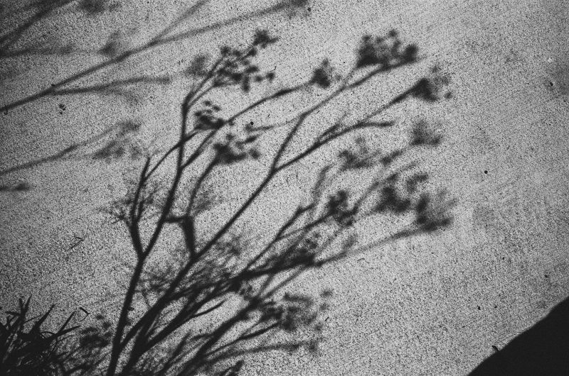


Or if you shoot digital, you can apply a grain filter or preset, or adjust the grain levels in your pictures using Lightroom.
Nostalgia

Black and white pictures are also more nostalgic. Why do we like nostalgic pictures? Because we find security in the past. We nostalgize over the “good old times”— perhaps because we don’t want to lose our personal memories. And memories is what make us human.

Repetition/rhythm

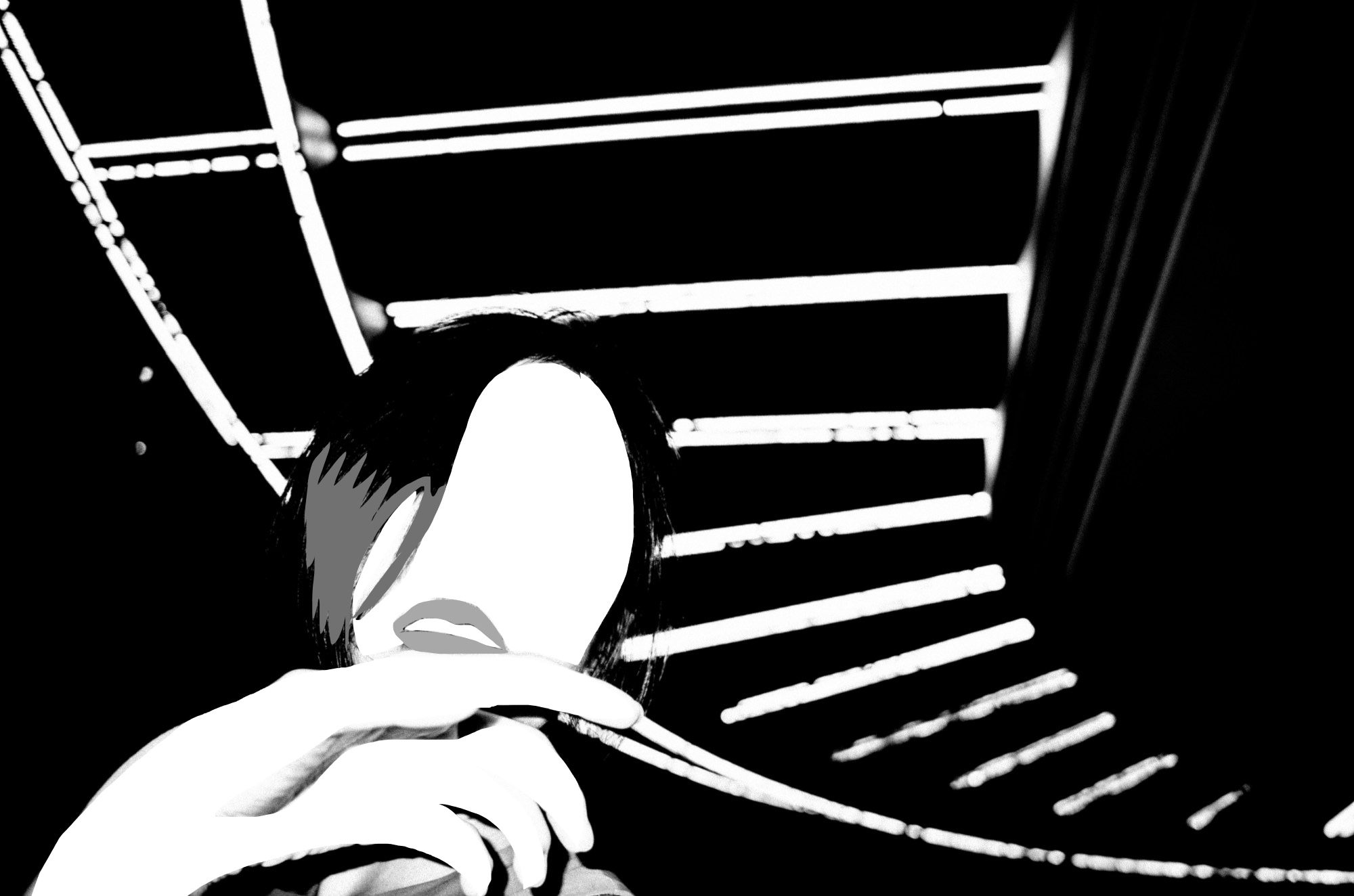
As a case study, let us analyze this picture of Cindy in Saigon, in front of a hotel at night.
The reason why the composition works:
- Eye contact from Cindy
- Curve in the background (blue line), and curve of Cindy’s hand
- Repetition/rhythm of lines in the curve (red and yellow rhythm lines)
- Strong figure to ground (contrast between black and white, because of the flash)
- Dynamic low angle perspective


Takeaways

- When shooting at night, experiment using a flash to create more separation between subject and background
- Integrate dynamic curves in background of the scene
- The more lines, the better (make sure there is separation between the lines. Avoid overlapping lines).
Master the fundamentals of Dynamic Composition with ERIC KIM >
Shoot black and white in color

To challenge yourself in black and white and see in black and white, look for black and white scenes (while shooting color JPEG in your camera).
Personally I like to shoot abstracts, and I practice my composition.
If you simplify the scene, you can see the balance of the composition:

Assignment: Only shoot black and white objects in color

For an entire week, only shoot black and white subjects and backgrounds (in color mode in your camera). This will train you to better visualize black and white.
It is easy to just shoot black and white mode on your camera, and simplify all the scenes you see in the real world.
Shooting monochrome in color is more fun, and more challenging.
Add color to monochromatic pictures

Understand black and white imagery better by adding filters in Photoshop or layers in image processing applications.

For example, I applied filters like “hard light”, “overlay”, “difference” in ProCreate App on iPad, to better visualize and understand my black and white images.


Conclusion

With black and white and monochrome, think outside the box. There have already been decades of classic black and white photography.
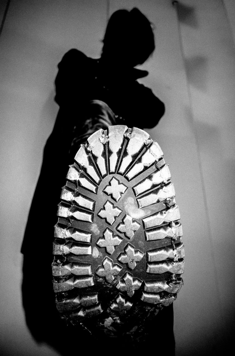
How can we drive the aesthetic of black and white photography forward?

My suggestion: experiment, have fun, and play.
All theory is just theory. More important than Theory: treating photography as your own visual playground, to figure out things for yourself.
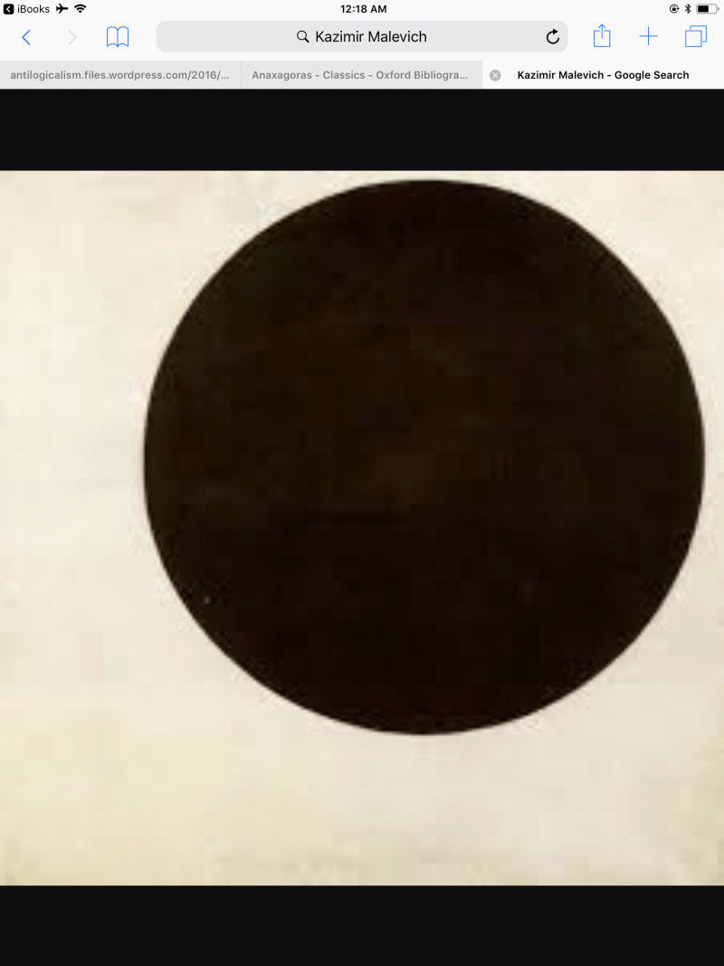
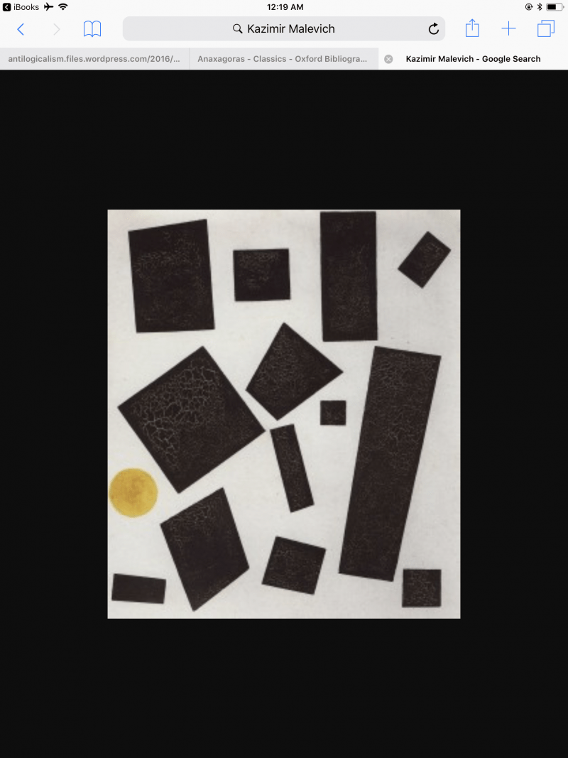
Even now, I’m still trying to understand what makes a compelling black and white picture. I’ve found the biggest insights from outside of the art of photography. The suprematist artists are good to study:







Black and white photography masters

In my opinion, the black and white masters you should study include:
Learn from them, steal from them, but make your own monochromatic, black bliss.
And when you’re done with them, kill your masters.
BE BOLD,
ERIC
LEARN FROM THE MASTERS
LEARN FROM THE MASTERS OF STREET PHOTOGRAPHY by HAPTICPRESS
Learn From the Masters of Street Photography on Amazon >
HAPTIC INDUSTRIES
HAPTIC INDUSTRIES: Creative Tools to Empower You.
The story of HAPTIC
STREET NOTES.

STREET NOTES PAPER EDITION ON AMAZON >
Push yourself out of your comfort zone with STREET NOTES: Mobile Edition.
GRAIN IS BEAUTIFUL.
FILM NOTES: Bring Back the Old School.

