Color Theory For Photographers

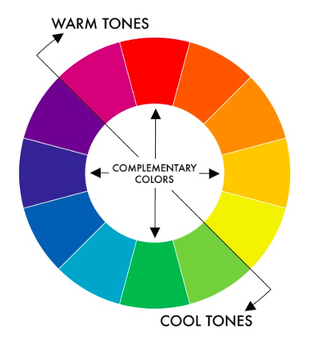
Color wheel theory: Dynamic tension between opposing colors.
Color wheel theory: Dynamic tension between opposing colors. Image from CREATIVE EVERY DAY

How to harness COLOR THEORY from art to make better color photographs:

ETERNAL RETURN to CREATIVE EVERY DAY >

CREATIVE EVERYDAY Spread

Inspire your visual artistry with ETERNAL RETURN to CREATIVE EVERYDAY BOOK >


Color Theory 101

Colors: there are no definitive “rules” to what makes a good color photograph or not. But, there are certain principles, guidelines, and theories on how to make better color pictures.

COLOR WHEEL

For example, take the color wheel.

1. Warm vs Cool Tones

According to this theory, you want to contrast “warm” tones from “cool” tones.

2. Complementary Colors

Also, colors on the opposite sides of the color wheel (red vs green, orange vs blue) are “complementary colors”— colors that complement, or balance each other well:

Color wheel theory: Dynamic tension between opposing colors.
Color wheel theory: Dynamic tension between opposing colors. Image from CREATIVE EVERY DAY

Warm vs Cool Tones

Examples of some of my photographs that illustrate “warm” vs “cool” tones:

Warm tones of the orange-red textures, contrasted against the “cool” blue background of this texture.
The “warm” tone of the woman’s orange face, contrasted against the “cool” tone of the blue background.
A red “cloud” against a mostly “cool” colored background.

Complementary Colors

Blue and Orange/Red

Man with flip phone. Tokyo, 2017
Dynamic and aggressive composition, because shot from low angle, which emphasizes the diagonal lines pointing to this man. Orange of his face against blue background.
Orange, blue, and green colors.
Orange of the building complements the blue of the sky.
Blue triangle complements the red rectangle.
Kyoto selfie with Cindy. Reflection, 2017
Shot through the reflection of an aluminum espresso machine. Kyoto selfie with Cindy. Reflection, 2017. Orange and Blue.
Orange and Blue.

Red vs Green

High angle shot of red and green crosswalk. Shibuya, Tokyo 2017
High angle shot of red and green crosswalk. Shibuya, Tokyo 2017. Green on bottom of the frame, and red on top-right of the frame.
IKKO TANAKA x ERIC KIM
IKKO TANAKA x ERIC KIM. Green vs Red
Red vs Green // IKKO TANAKA

PRIMARY COLORS

“RYB”- red, yellow, and blue mixing to make other colors.

Another theory in photography and color: that there are three “primary” colors:

  1. Red
  2. Yellow
  3. Blue
RYB color chart from George Field's 1841 Chromatography; or, A treatise on colours and pigments:
RYB color chart from George Field’s 1841 Chromatography; or, A treatise on colours and pigments:

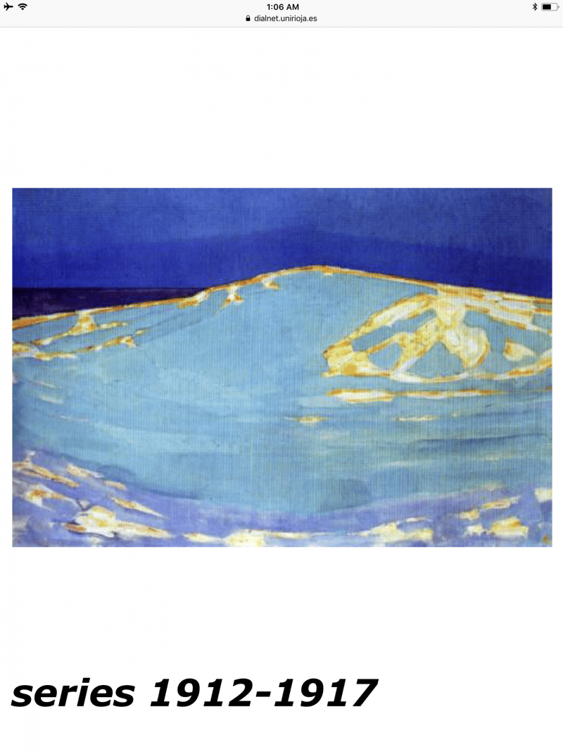
The best artist to study primary colors (red, yellow, blue) is Piet Mondrian, who distilled artistic composition to the primal basics:

Believe it or not, yet, Piet Mondrian did know how to paint. Here are his earlier works; note how he integrated color theory into his work:

Anyways, we can learn to better integrate these primary colors into our photos, by focusing on one primary color at a time:

Red pictures

Cindy behind red curtain. Kyoto, 2017
Kyoto, 2017 #cindyproject

Red and yellow storefront. NYC, 2017

Red and car. Urban landscape. Madison, Wisconsin.

Diagonals and selfie. Red. Tokyo, 2017
Off-center self portrait in red.

Man with red tape. Venice, 2013
Man with red tape. Venice, 2013. Leica MP + Leica Summicron 35mm f2 ASPH + Kodak Portra 400

Yellow pictures

Man with hands in prayer. Wisconsin, 2017. Pentax 645Z.

Woman in airplane. Sunset over NYC. Pentax 645Z

Cindy sleeping. NYC, 2017. Pentax 645Z

Lamp shade. Madison, Wisconsin.

Cindy in front of colorful mural. Madison, Wisconsin

Sunset in Istanbul, 2013.
Portrait of my sister, Annette Kim on Hasselblad 501c / Kodak Portra 400.

Blue pictures

Blue window and reflection.

Blue shadow. Madison, Wisconsin.

Cindy by water. Madison, Wisconsin.

Airplane. Eric Kim.

Woman with umbrella in rain. Tokyo, 2017

Airplane and telephone wires. Downtown LA, 2013
Leica M6 + Leica Summicron 35mm f2 ASPH + Kodak Portra 400

Red, Yellow, Blue

Red, yellow, blue, green.

HAPTIC INDUSTRIES LOGO

Red, yellow, blue eggs.
Uji sunset, 2017.
Uji sunset, 2017. Red, yellow, blue.

Practical tips to apply color theory to your photography

1. To train your eyes, learn to shoot in color by only shooting JPEG.

Kiss. Cindy, Saigon, 2017

The camera does a better job processing colors natively, as JPEG, in-camera when compared when you try to process RAW color pictures. It is true that shooting RAW will help you modify the colors of your pictures with more latitude, flexibility, and control — but shooting in JPEG will help train your eyes to see color in real life.

HAPTIC EYE by ANNETTE KIM

2. Focus on one color at a time:

Color.
Chroma.

Try to do a mini photo project on the primary colors of RED, YELLOW, and BLUE. For a day, only choose one of those primary colors. This will help your eyes build the SENSITIVITY of your retina to a specific color. So for one day, only shoot RED. Another day, only shoot BLUE. Another day, only shoot YELLOW. Try to simplify the scenes you photograph as much as possible.

Red texture. Kyoto, 2017.
Stylish woman outside of department store. Kyoto, 2017.
Stylish woman outside of department store. Kyoto, 2017. RICOH GR II with P mode and flash.

3. Study colorful art

Picasso rose period.

Look at a lot of colorful art when you’re not taking pictures, to better learn for yourself: “Which colors appeal to me the most?”

Picasso. Azul period.

4. Trace, analyze, colorful art

The best way to understand color: deconstruct the work of your favorite color painters or artists. I made these with my iPad and Procreate app:

Picasso x KIM
PICASSO x KIM

ETERNAL RETURN TO CREATIVE EVERYDAY

To inspire yourself more, pick up a copy of Eternal Return to CREATIVE EVERYDAY >