I’m currently inspired by a lot of painting, and trying to figure out how I can improve my compositions in photography from the masters of art, starting off with Raphael:
1. Tension
One of the things I note about Raphael is his use of tension.
For example, in his painting ‘Saint George and the Dragon’Â — you can see the tension of the man on the horse about to slay the dragon.
To me, the most interesting thing is how his sword is lifted up, looking down at the dragon, at the moment before the ‘decisive moment’ of slaying the dragon.
A practical way we can apply this in photography: take a photo before the decisive moment happens.

2. Uncertainty
In his painting of Pope Julius II, I notice the look of uncertainty of the pope, as he has a down-trodden look, as well as the tension in his right hand.
A practical way we can apply this in photography: photograph our subjects looking down (or ask them to look down), and also pay attention to their hands.

An example of a photo I shot, with the man looking downwards, looking downtrodden:

3. Eye in the center of the frame
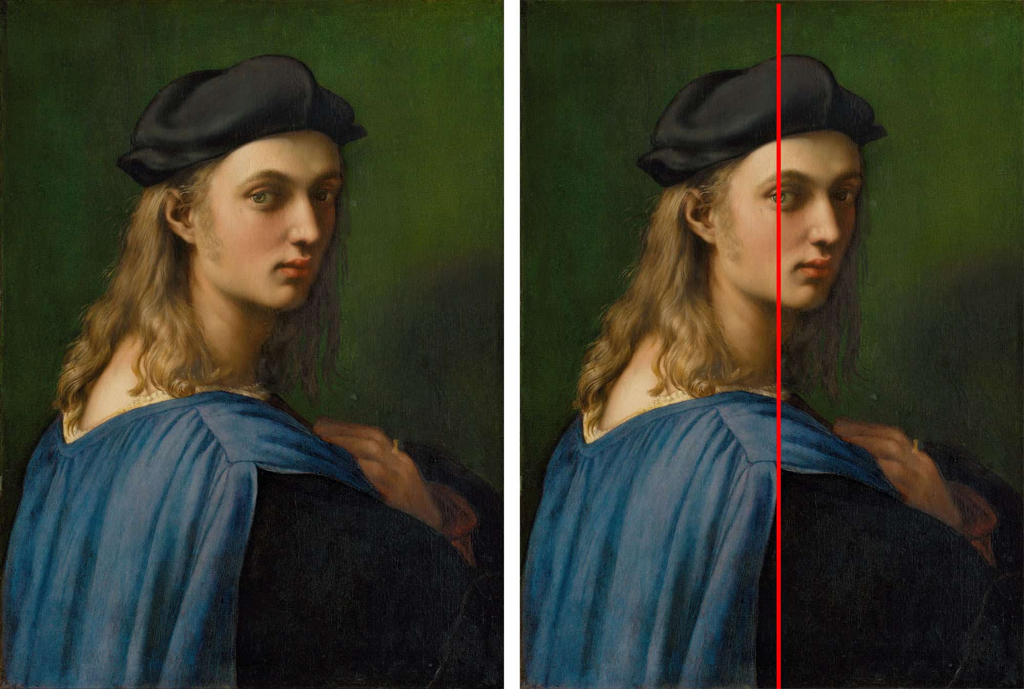
In his ‘Portrait of Bindo Altoviti’, note how the eye of Bindo is centered in the middle of the frame. Not only that, but notice how Bindo’s body is turned left, while his eye turns right towards the viewer:

Also in another example, see this painting of Fornarina, Raphael’s mistress:

So the takeaway point is this: when shooting photos, try to center the eye. A technique that Steve McCurry used quite well (either on purpose, or accidentally):

4. Three subjects
I also am obsessed with the idea of three– how Raphael did well, showing three subjects in his painting of the three graces.
To me, I love how not only are they all looking in different directions, which causes tension in the frame, but they are also holding circular objects, which accentuates the curves in their body:

In another painting by him: ‘Madonna of the Goldfinch’ — you can see how there are three subjects, all looking in a triangular shape, which draws your eyes around the frame, and achieves perfect balance and harmony:

With the arrows drawn in:

The practical way you can add this to your photography, restrain your subjects to three subjects, and try to create some sort of balance and harmony between them.
For example, this is a shot that I very much like that I took when I visited Mumbai. There was a boy just kinda hanging out over a bench, an older man (maybe his grandpa) on the far right, and an interesting painting of a man on top.
I saw all three of these elements when I was shooting it, and I took about 5 different shots. This one came out the best. Note how I have three different subjects in the shot who are all people, but different. The main subject is the boy (youth), then the older man on the right (elderly), then the painting on the top:

With the triangles in:

To learn more, read my lesson on triangle compositions >
Learn more about composition

For distilled lessons on composition, read the free ebook: “The Street Photography Composition Manual.â€
Further articles to improve your compositions in photography:
- Composition Lesson #1: Triangles
- Composition Lesson #2: Figure-to-ground
- Composition Lesson #3: Diagonals
- Composition Lesson #4: Leading Lines
- Composition Lesson #5: Depth
- Composition Lesson #6: Framing
- Composition Lesson #7: Perspective
- Composition Lesson #8: Curves
- Composition Lesson #9: Self-Portraits
- Composition Lesson #10: Urban Landscapes
- Composition Lesson #11: “Spot the notâ€
- Composition Lesson #12: Color Theory
- Composition Lesson #13: Multiple-Subjects
- Composition Lesson #14: Square Format
See all composition articles >
More paintings by Raphael
Some other of my favorite paintings:


Learn more: Photography 101 >
