
For today’s compositional lesson– I want to talk about color theory— and how you can better utilize colors when it comes to your street photography.
Personally around 2 years ago, I made the switch from shooting fully black and white — to just shooting color film (Kodak Portra 400).
Since then, I have learned to see the world in a totally different way. It has been fun, refreshing, and quite exciting.
However at the same time– shooting in color presented a new bag of worms. Whereas black and white tended to simplify a scene, color could be distracting and take away from a photo (if the colors didn’t add meaning and value).
So for this lesson we will talk about some color theory — in terms of how we can make colors better work for us. I am certainly not an expert when it comes to working in color, but I will try to share some practical tips of how you can better shoot street photography in color.
Complementary colors

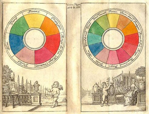
The first theory we will tackle is “Complementary colors.” What are complementary colors? Well, this is the definition according to Wikipedia:
Complementary colors are colors which cancel each other’s hue to produce an achromatic (white, gray or black) light mixture.
Complementary colors tend to work really well together– and create a nice harmony that feel balanced.

If you want to think of easy complementary colors to think off the top of your head. Here are some examples I came up with:
Sports Teams
Often sports teams use complementary colors. If you watch the NBA, here are some examples:
Los Angeles Lakers (Violet and Yellow)


New York Knicks (Blue and Orange)


Beer
Marketers also love to use complementary colors when it comes to creating logos. For example, our beloved Heineken beer has the same “Christmas colors” (Red and Green)– which are probably the most famous complementary colors:


So now let us delve into some street photos that have great complementary colors. We will draw heavily from Steve McCurry– one of the best color photographers alive:
Complementary colors: Red-Green

In this captivating portrait McCurry captured– you see two kids covered in all red powder. The kid in the foreground is looking straight at the camera, with his piercing eyes and inquisitive look. The background is a blueish-greenish hue, with some red marks on the left of the wall– and another kid blurred in the right of the frame.
The child in the foreground looks curious– and reminds me of my curiosity when I was young too. And those eyes are just so powerful– it is an image that burns itself into my mind.
Do you see the complementary colors in this shot? Yes, it is red and green. Because the background is a greenish-blue hue, the red of the kid’s face really pops out from the background. In a more simplified color wheel, we show it below:

This red-green dynamic also occurs in one of his most famous photos– the Afghan Girl:

The red-green dynamic here is quite amazing. First of all, you have a simple green background, and hints of green in her tattered shirt– and of course, those amazing green eyes. In terms of red, you see it in her clothing, and her skin. It creates a nice rhythm that alternates between red and green.
In terms of the image itself, it has a sense of mystery and intrigue. This young Afghan girl has clothing that is falling apart and is probably in a more destitute condition, yet she shows her power and willingness in her eyes. She seems to have the fire burning inside her that will help her overcome any obstacle that confronts her.
A bit off-topic (thought you might be interested), but McCurry also tracked down the young girl — and below is a photo of her now (and before). She still has that look in her eyes:

You can also see how having a certain color predominantly occupying the background– and having one figure as a complementary color, it create a strong figure-to-ground relationship.
For example, in the photo below– we see a predominantly red background– with the one figure of the man in green. What happens? The green pops out at us:

A good test if a photo has strong figure-to-ground is to blur the image. If you can still see who the predominant subject is– the photo works:

Complementary colors: Orange-Blue
Some other complementary colors include the orange-blue dynamic. Steve McCurry has tons of great examples — mostly of monks.

So you can see in this fun and quizzical image of a bunch of monks upside down (almost like spiderman)– in prayer position. The photo is first a bit puzzling, but once your mind wraps around what is going on — it becomes quite amazed by the strength and determination of these monks.
As you can see, the orange of the skin of the monks (and their pants) juxtapose well against the faint blue of the background. If we refer to the color wheel below, you can see that the orange-blue dynamic are strong complementary colors.

You can also see it in another photo by McCurry below (once again– monks):

Another great photo that shows this orange-blue dichotomy is this photo below by David Alan Harvey:

You see a jet-blue color on the left side of the frame, with a boy gently smiling in the middle of the frame. Then on the right side of the frame, you have an orangeish-red color, with an ominous looking (perhaps sinister) shadow of a man in a cowboy hat– approaching him. The photo makes me seem like it is impending danger– yet the boy looks so calm and hopeful?
Warm vs Cool colors
Another color theory comes to “Warm” vs “Cool” colors. What are warm and cool colors? For warm colors– think about colors of a sunset:
Warm Colors

- Red
- Orange
- Yellow
You can also see them on a color wheel below:

Cool Colors

- Blue
- Green
- Violet

So the theory of “warm” vs “cool” colors is that warm colors tend to be more active– and advance to you in a photo (or painting). And cool colors tend to recede into the background— and are less active.
So if you draw the attributes of color — warm colors tend to be more active, stimulating, and energetic. Cool colors tend to be more calming, relaxing, and chill.
Let us look at some examples of warm vs cool colors:


In this photo by Martin Parr, you can see how the skin of the woman is warm. Her skin is a orangeish-red hue. And the little blue eyepiece that covers her eyes are a deep blue– that pop out at you the viewer.

In another photo by Steve McCurry– you can see how the pink of the worker’s clothes really pop out from the mostly cold background (white and grey colors).

In another photo by Steve McCurry of a Geisha in Kyoto– you see that the warm color of her red kimono pops out from the cool background color that is a dirty white-grey.

In a photo I took for my “Colors” project– I saw an interesting mural that is predominantly a cool color (blue). The odd thing is that I saw a door cracked open by a warm color (orange) cone. The orange pops out from the background. I also think the photo is interesting and surreal because it is almost like a backdoor in the universe.

In one of Eggleston’s most famous images– you see a woman placing a straw inside her drink. The background is predominantly a cool color (the blue of the sky, and the white of the tray table). Then you see the orangeish-red of her drink (perhaps Coke) — it pops out as a strong color (warm).

In this photo by Alex Webb in which he shot on the outskirts of Tijuana, you see the mostly cool colors of the background. There is desolation and what appears to be abandoned buildings. It is a quite moody and grim feeling image.
Then you have the high-heels in the foreground, which are predominantly a very warm color — like the red of the high heels that simply pop out. It creates a fascinating juxtaposition between the dark mood of the background, and the elegance of the high heels.

In this photo by David Alan Harvey, there is a post-apocalyptic mood of the ominous clouds in the background. The colors are mostly cool– with the exception of the girl riding the bright pink horse in the middle of the frame. It is the one ray of hope and sunshine in the photograph.
There is also a great deal of surrealism in the photo– the girl’s face obscured by her jet-black hair. And her white dress– which is a symbol of purity and innocence. Then you have the nude black man in the photograph– which makes the photograph feel even more sensual.
Analogous Colors
Analogous Colors are also another color theory. The idea is pretty much that colors close to one another on the color wheel create a certain feeling and mood.
Warm Colors

In this famous photo by Steve McCurry– you have all these women huddled together in a sandstorm. The primary colors are the red of their dresses, and the orangeish-yellow hint of the sandstorm in the background. It creates a warmth in the photo– of the women protecting one another against the terror of the ferocious sandstorm.
If you look at the color wheel below, the reds to the yellows are all next to one another on the color wheel– that create a warm mood.
In one of the photos I took in Downtown LA — you see a man donning a red suit, complete with a pale yellow shirt, bright yellow sunglasses, and a striped orange tie. The background colors are predominantly warm (with the yellow seats and tables)– with a bit of cool colors on the top of the frame:
I feel that the mood of the photo is a very energetic and up-beat one. The man in the photo is certainly a character– a very eccentric one. I get the impression that he is ready to pop his collar– to take on the world– and he can take on anything. It is a very warm and inviting image.
The color red is also a metaphor for danger, caution, or warning. One of Eggleston’s most famous images is that of a light bulb on top of a blood-red background. The red of the background almost feels like that of blood. If I can remember the photo correctly, this photo was taken in the bedroom of one of Eggleston’s good friends. Sadly a few years after Eggleston took this photo, his friend died (I forget of what happened to him). The photo certainly does seem to be a dark and sinister image– that of impending doom.
Cool Colors
There are also photos out there that have primarily cool colors. These photos make you feel more calm, relaxed, and are much more mellow.

In this photo by David Alan Harvey, you have a man looking as if he has his fingers interlocked as in prayer. Behind him is what seems to be his hat– sitting quietly by itself. Then the pastel-blue-green (and his blue shirt) create a calm and relaxed mood. It perfectly fits the somber mood of the man in prayer.

In this photo I took in Mumbai, you see a man’s hand over a blue patterned background. The colors in the background are predominantly blue– which adds to the relaxed and calm mood of the image.

In the above photo by William Eggleston, it is predominately cool. You have the moody pale blue of the sky, with it going the blueish-green of the mustang in the foreground. The woman in the car is doing a fascinating hand gesture with her left hand. Perhaps she is signaling she is going to turn left? Or she is waving goodbye? Or she is just gently touching the cloth convertible top? The nice touch of this photo is also the stoplight in the top left corner– which is supposed to control traffic and speed. And of course, the mustang is a symbol of speed.
But the overall mood of the photograph — with its cool colors, feels calm and relaxed. It is the mood you get when it is a rainy and overcast day outside– and all you want to do is sit at home and drink hot cocoa.

In one of my favorite images, I took a photo of a man taking a nap at a beach in Marseille, in the south of France. The background of the water is a lovely blue-green hue, which puts you at ease. Of course the man sleeping makes the photo feel even more relaxed. Therefore the photo makes me think of dreams, reverie, and no worries about the world.
Conclusion

So one of the questions you might be asking yourself is: “How conscious are the photographers of the colors and these color theories when they are actually out shooting these photos?”
I can’t speak of other photographers — but for myself now that I shoot exclusively color, I specifically look for color when I am out shooting. I look for colorful people, colorful scenes, or colorful things. And then of course in terms of whether the colors work in harmony or not– that is sometimes luck, and is determined in the editing phase.
However in the real world (when shooting street photogrpahy), the most practical way you can apply color theory on the streets is the “warm” vs “cool” color theory.
For example, if you see a mostly cool background color (blue, purple, green)– try to wait until someone with a warm color (red, orange, yellow) shirt walks by. It can be the other way too. You can look for a mostly warm background– and wait for someone with a cool colored shirt to step into the scene.
At the end of the day though it is easy to say whether colors work or not in hindsight. But I still think it is important for us to keep these color theories in mind. The more we think about it consciously, the more we can apply it when we are out shooting in the streets.
Also another thing you want to think about is the value that shooting street photography in color adds. Are you simply shooting street photography in color for the sake of it? Or are you trying to create a certain mood through the colors you capture? Do the colors in your photo add context and meaning?
If you are interested in shooting more street photography in color– here are some of the best photographers I recommend you to check out their work:
Color Masters

- Alex Webb
- Martin Parr
- Constantine Manos
- David Alan Harvey
- Stephen Shore
- Joel Sternfeld
- Carl de Keyzer (see his “ZONA” book)
- Alec Soth
Contemporary Color Street Photographers

Below are some contemporary street photographers whose color work I really enjoy– in which color adds depth, emotion, and context to the photos: