
All of the photos in this article are copyrighted by their respective photographers.
For today’s composition lesson I want to focus on a compositional technique that is more utilized by intermediate/advanced photographers. It is the idea of depth.
What exactly is “depth” anyways? Well, the Merrian-Webster dictionary provides this definition (which we generally think of when it comes to spatial relationships):
- a: the perpendicular measurement downward from a surface
- b: the direct linear measurement from front to back
For the purposes of photography and composition, we will use b (the direct linear measurement from front to back).
But the problem is with photographs are that they are 2-dimensional. They are flat. Inherently they have no depth. Sure the photograph can provide an illusion of depth, but the photograph itself will never have real depth. For example, you can’t hold up a photo you print and literally reach inside of it.
I have mentioned this in previous articles, but composition for composition’s sake is pointless to me. Rather, I feel composition should be something that helps support the content in a photo (what is happening in the photo). I want form (composition)Â to come after content (the soul of a photograph- and how it makes the viewer feel).
Therefore let us never forget the more important definition of depth (when it comes to photography) as Google provides:
Depth: Complexity and profundity of thought.
Let us remember that at the end of the day, it is the complexity and profundity of thought which makes a photograph meaningful and memorable. Sure a photograph may have lots of different layers, but who cares if it doesn’t have layers of emotion, soul, and meaning?
Anyways let us jump straight into this composition lesson with some examples from the greats:

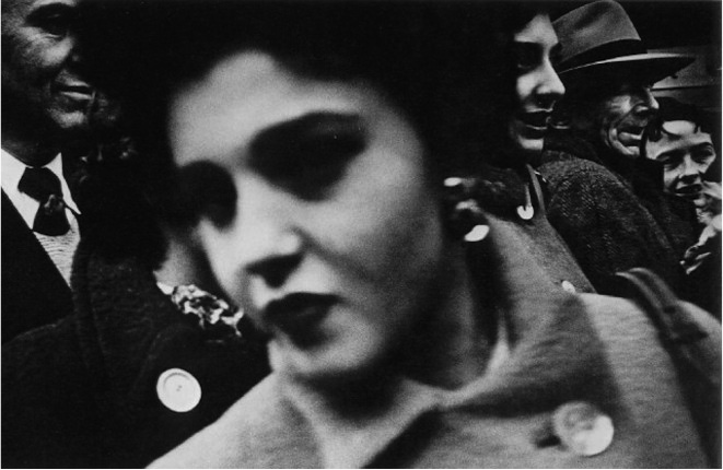
This is one of my favorite photographs by William Klein. When we first look at the shot, you first see the out-of-focus woman in the foreground which fills about 60% of the frame. She has dark and hallowing circles around her eyes, which make her seem like a ghost or an apparition. That echoes through her jet-black lipstick, which makes her a bit of a mystery.
Small touch which I love is the button in the bottom right of the frame, which echoes in the button on the bottom left of the frame. It almost looks as if those buttons in the frame are her missing eyes.

Then if you look in the background, there are all of these people who are looking on the right side of the frame. I am not sure what they are looking at– but our eyes (as the viewer) look the direction they are looking at. There are 3 people in the frame that are looking right, one guy who is looking more toward our direction, and the woman is moving left. This creates a nice sort of visual tension in terms of which way our eyes are pulled.
Considering the woman in the foreground is so large and prominent in terms of the frame– I feel that her moving left balances out the 3 smaller figures looking right:

So you can see above in Figure 2, the directions which your eyes are lead around the frame. It creates a dynamic and edgy type of image that is full of energy, motion, and commotion.
What I really wanted to focus on this shot was the depth in the shot. Note how the subjects in the background are in focus, while the woman in the foreground is out of focus.

So if you look at Figure 3, you see the woman is taking about 60% of the frame and is smack dab in the center of the frame. She is also considerably out of focus.
I think Klein might have shot this with either a 28mm or a 35mm lens and set his focus to around 1.7 meters, focusing on the people in the background. And the woman who is closest to the frame is probably around .4 meters away from Klein, which means she won’t be in focus (assuming he shot this with a Leica, the minimum focusing distance is only .7 meters):

See how the figures in the background are on another plane (layer). I have outlined them in green.
Below I have now added both the foreground and the background of the shot. The foreground of the shot is the woman outlined in red. The background of the shot is the people in green.
So if you analyze the image, there are two layers. The distinctive woman in the extreme foreground and the people in the background.
So you can see by embedding these two layers in the shot, Klein made for a much more compelling image. The shot has depth to it– you feel like you are standing right in the crowd. He has filled the frame effectively, there is no spot in the frame which is not occupied. The frame feels complete and whole and packed with action and intensity.
I think ultimately Klein wanted to convey the sense of intimateness and proximity to the people- and he has done this effectively by adding these layers.
Takeaway point:
What I really wanted to stress in this example is how Klein didn’t just focus on the person closest to him in the frame (the woman). This is often what we are taught in photography: that you should always focus on what is closest to you in the frame.
However we learn from Klein that it is often more effective to focus on what is furthest away from you to create depth.
The best way to do this technically is by using manual focus. Try to shoot in a close proximity, and keep your focus preset to around 1.7-2 meters. Then try to position yourself and photograph where someone is in the extreme foreground.
I will show an example where I did something similar:

In this photograph I shot in Hong Kong, I thought it was interesting how this exotic orange car was given a ticket by this officer. I kept my focus to around 5 meters (I am shooting with a 35mm lens) and wanted more people in my extreme foreground. Therefore I kept shooting and waiting for people to enter the scene in front of me.
What I first enjoy is the sense of movement and direction in the photo:

Ultimately I like the effect of the image. You see the exotic car getting a ticket by the officer, and the man in the top center of the frame looking curiously onward– wondering what is happening. And what I love most about the shot is the two women who are out of focus, nonchalant about the entire situation, colliding heads in the bottom left of the frame. You can see that the women create another level of depth in the shot.

I also outline everything else which is on the further layer in green (what is furthest away from you in the frame):

I then merge both layers, so you can see the depth between what is closest to us (red) and what is furthest away (green):

So you can see that my shot (similar to that of Klein) has 2 distinctive layers. The people in the foreground, and the background.
Granted that Klein’s shot is a 100 times better than mine– I still took Klein’s idea of filling the frame and adding depth to my own photograph.
What I could have done differently is framed the whole shot tighter. Perhaps framed it like below:

If I took a step closer and framed it tighter, the photo would be much stronger in my opinion.
However my personal rule is to never crop – as I think it makes me a lazy photographer and prevents myself from working hard to get the shot right “in-camera.” I am not a Nazi when it comes to cropping to everyone else – but I generally recommend to never crop more than 10% of the frame (around the edges- while keeping a consistent aspect ratio).
Klein was a radical cropper and did some crazy stuff in the darkroom. Robert Frank cropped a lot of his shots significantly (he even cropped some of his horizontally-shot photos into verticals). Keep this in mind- there are no hard-set “rules” when it comes to cropping. But based on personal experience, I find cropping makes street photographers more lazy.
To move on, I want to show an example of where you can kill depth by flattening the image. This is a great photograph by David Alan Harvey:

I love the photograph because of the energy, excitement, and movement of the photograph.
To first start analyzing the shot, DAH has filled the frame beautifully with all of these different kids:

The frame feels very balanced, as there are kids all around the frame and other elements in the shot.
Secondly, I love the sense of movement and energy through the shot. Look at all the directions the shot moves:

When we first look at the shot, we feel it has a lot of energy and excitement. But where does that come from? I think it is from the way the eyes of the kids and the way their bodies are positioned (as well as the leading lines of the slide, and the jungle gym rings.
What I want to note which is the most fascinating is that there is actually a lot of depth in the shot (in the real world).
For example, we know which kids are closest to us in the frame and which are furthest away because of their size in respect to the frame.
The kid in the extreme foreground is the closest to us– as he is slightly out of focus and his head is far bigger than the rest of the other kids:

Then if you look at the midground (what is slightly further away in the middle) are the kids on the far left and far right of the frame (outlined in green):

Then if you look at the background, you have the two little kids:

So you see the kids furthest away are outlined in blue.
So in the real world, we know there is depth in the shot. We know that some of the kids are closest to us, while some of the other kids are further away from us (due to their relative size). However visually, the photo feels flat. It has no depth.
What do I mean by this? Well, the photo becomes flattened because visual elements connect to the subjects.
Let me elaborate via examples:
1. Note how the boy in the extreme foreground gets pulled into the midground. This is because his head is connected with the slide (which is in the midground). This therefore pulls the foreground into the midground.

If the kid’s head was a little bit further down in the frame and not connected, then there would be more of a perception of depth in the shot:

So in Figure 7, you can imagine how the shot would look if the slide was disconnected from the kid’s head. This creates more depth in the shot and causes the photo to not feel as flat. Note the crucial white-space between the kid’s head and the slide:

Henri Cartier-Bresson once said something like “2mm makes all the difference.” 2mm can make the difference between adding depth in the shot, or making the shot flat.
Next I want to inspect the kid on the far left– he almost looks as if he is hanging off the slide as well (his hands are positioned on top of the slide):

So you can see, this adds another layer of connection in the shot — and flattens the image. To build upon this, you can see how this connects to the kid in the bottom middle of the frame too:

Moving on, let us focus our attention to how the kid on the far right of the frame connects. Let us first start by outlining what is in the background, which is this pastel yellow wall:

So visually we know the wall is the furthest element away from the frame, as we see the two small kids on top of it.
However because the kid on the far right is coming into the middle of the frame, it almost looks as if he is resting his armpit on top of the wall:

What is extremely compelling is that it looks like the chains in the background are holding up the yellow wall– which makes the whole image feel connected and flat:

The chain in the middle-right of the frame is also connected to the wrist of the boy in the far right of the frame– which brings him into the frame on the same plane.

This effect of the background connecting with the midground makes the image visually flat.
Takeaway point:
You can see in these series of examples, DAH has masterfully crafted an image that is purposefully flat. There is no visual depth to the shot.
The question you might be thinking to yourself is: “Did David Alan Harvey really intend to make all of these layers and draw all of these red, green, and blue lines in his shot?”
Well I am sure he didn’t see all of these lines in his head when he was taking the photo.
Some things I do feel that are certain that DAH did intentionally:
1. What I am certain of is he tried to get all of the subjects in the frame spaced out like we saw in Figure 1:
2. He tried to connect the slide in to the kid’s head in the bottom of the frame (illustrated in Figure 6):
3. He tried to get different gestures and directions of the kids. I am not sure he tried to get it as complex as iIllustrated in Figure 2– perhaps more like Figure 2a:

There is only so much information our eyes can process when we see a great scene in front of us. But I am sure that DAH at least saw the movement of the arrows facing bottom right versus the arrows pointing top left. And of course he didn’t see the arrows explicitly– but the directionality.
So if you want to create a visually flat image (on purpose) — just connect the subjects to the background elements.Â
Moving on — let us look at examples when there are distinctively more than simply 2 layers (as saw in Klein’s example at the beginning of this lesson). Let us move onto where there are 3 distinct layers (via the master of layers, Alex Webb):

This is one of my favorite photos by Webb. First of all, I love the colors of the shot– the soft sea-green pastel of the wall juxtaposed against the vibrant red-orange-purple hue of the sky. It makes for a lovely mood and feeling.
I then love these two guys on the far right standing on a bicycle, and having their arms propped over the chain linked fence. They look curiously over at Alex Webb, while having white towels casually flipped over their shoulders.
Then you see in the far left of the frame of 2 ladies looking towards the left of the frame. The one in the dress is looking left with her arms crossed, and it appears the woman in the checkered dress is also looking at Webb.
The coolest guy in the frame (I think) is the guy in the top left of the frame, who has a great gestures of having his knee perched on top of the railing, and his arms hunched over casually– also looking left. It makes me wonder what they are all looking at–perhaps some sort of sports event?
Regarding the composition, like we learned in Lesson #1 about Triangles, you can see a lovely triangle between all three of these areas of the frame:

You can see in Figure 1, I specifically numbered the subjects accordingly.
- #1 is the two guys closest to us in the frame
- #2 are the two ladies who are slightly further away
- #3 is the man more off in the distance, the furthest away from you in the frame
What makes the guy #3 whereas the women are #2?
Well you can tell by the height of them. The man is shorter than the women in the frame– and you can see he is more off into the distance.

So you can see the three levels of depth in the shot.
- #1: Kids closest to us on far right: foreground
- #2: Two women in bottom left: midground
- #3: Man in top left corner: background
There are more than one way you can add depth to a shot– instead of just having people placed in different parts of the frame. You can also incorporate reflections into the shot, as we will see by Webb below:

As you see in this shot by Webb, there is enough spacing between all of the different geometric shapes in the shots (between the lights and darks). Therefore your eyes are lead through the shot– from inside the barbershop into the middle of the streets (which is brighter).
Conclusion
In this article we have shown how you can better include depth in your shot to lead the viewer through your photo and feel like an active participant of the scene— as if the viewer was really there.
There were also examples of where the photographer (like David Alan Harvey) made the photo purposefully visually flat– to make the photo feel more enigmatic and surrealistic.
So experiment with depth, layers, and don’t forget the most important part of a photograph– the emotional depth you create. Composition comes second.