A thought when it comes to black and white, and monochrome aesthetics in photography:
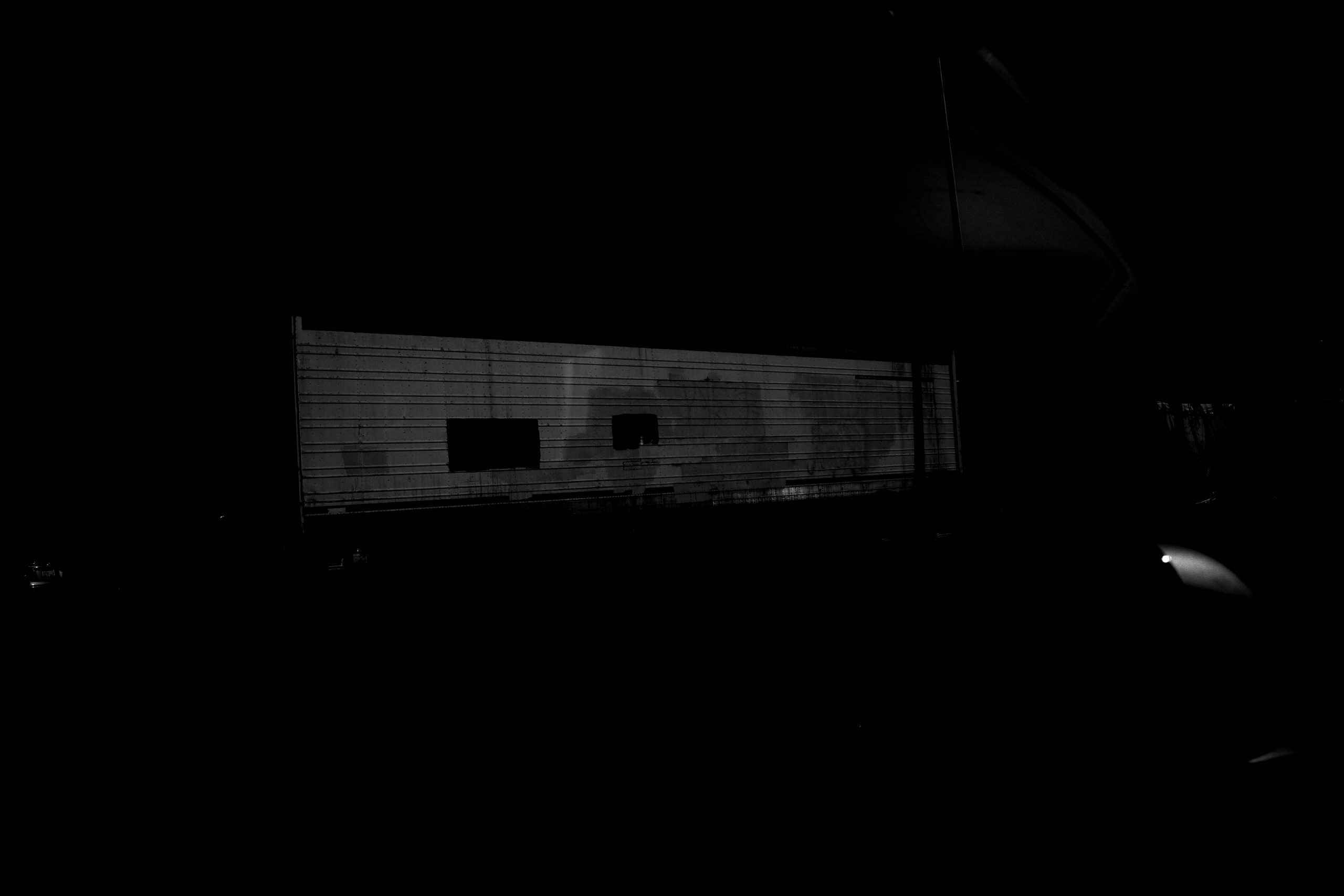
When you make photos as dark as possible, and crush the blacks, and make the contrast the maximum, what we are doing is applying more black ink to our photos.
Like calligraphy, we love the black ink!
Thus when you’re composing and framing a photo, don’t include the bright — optimize for the dark.
Once again, do not include anything that which is bright in your frame, especially in the corners of the frame when composing. Just get closer. Stick with your wide-angle prime lens, and just use your ‘foot zoom’ to get closer to your subject-matter, and fill the frame with that which you find interesting.
Fill the frame with black. Our disdain for that which is *NOT* black.