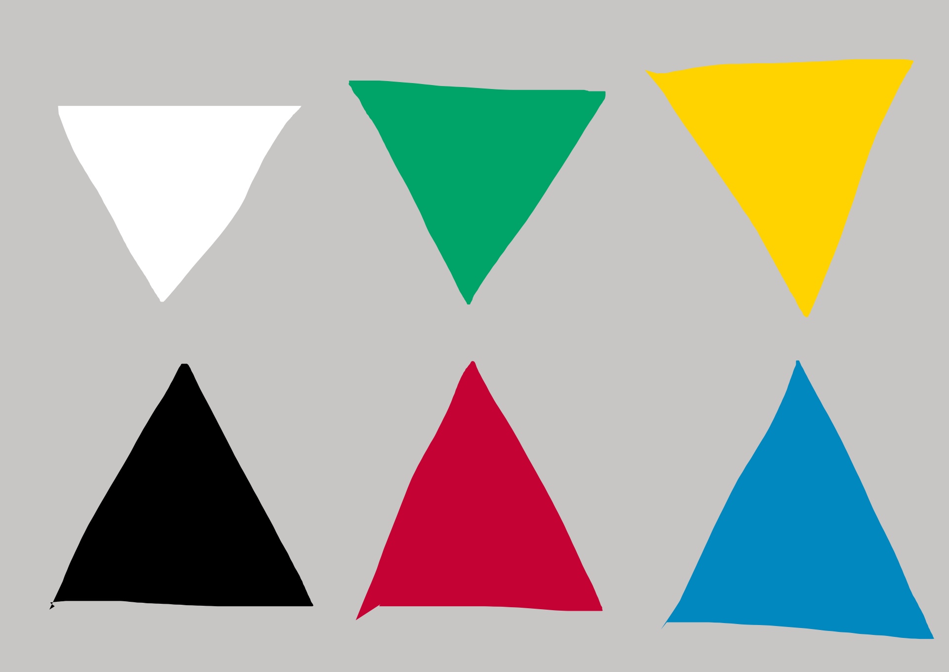
Another theory on colors: “Opponent Processâ€â€” which states that our perception of colors comes from the contrast, or having opposite “opponent†colors battling the other color.
The primary colors
For example, note the swatch of colors below:
- White vs Black
-
Green vs Red
-
Yellow vs Blue

Now we can see that these are also “complementary colors†on the color wheel:

Color experiments
Let us experiment with these colors, and see what effect they have on us psychologically:
Green vs Red
The green background with red shapes is more pleasing to the eye, instead of the red background with green shapes.
My theory: Red is a more powerful color than green, and therefore works better as a figure against the background. Color theory for “figure to groundâ€.


Yellow vs Blue
Yellow seems to be a more dominant and powerful color than blue.
Therefore, it seems that a blue background with a yellow figure causes the yellow figure to “pop out†more.
However, a yellow background with a blue figure also looks pleasing to the eye. I imagine a golden sunset, with a blue mountain in the background.


Black vs White
White is typically associated with light, life, and purity. My theory is that as biological beings, we need light for food, warmth, and life.
Black is typically associated with death, fear, and the unknown. As humans we have traditionally feared the dark — the absence of light, because that is where predators may be. Also, when your food is too black and charred from cooking, it tastes no good.
In terms of the color opponent theory — I prefer a black background with a white subject. It is easier on my eyes. Even Leonardo da Vinci said when painting, start with a black canvas/background.
Of course, a black subject against a white background also pops out a lot, and has strong “figure to groundâ€.


Findings

It appears that the colors mentioned above are strong contrasting colors, and are naturally pleasing to the eye.
Therefore when you’re making pictures (either candidly, or in the studio), try to integrate these colors into your pictures.

Also, whenever possible, switch the order of the opponent colors. Have the more “dominant†color act as the background, instead of the foreground. Study the psychological effect the colors have on you.
Black and white photography

It is much easier to make high contrasting black and white pictures, instead of color pictures with yellow vs blue, or red vs green.

This is why I think black and white photography is so successful — ability to create a strong “opponent process†or colors.


Color photography


How to apply this color theory to your photography:
Yellow vs Blue in color photography
Orange and yellow are quite similar in color. Try to combine them whenever possible.


Red and Green in color photography
To be frank, I don’t see a lot of green and red scenes. But whenever possible, try to incorporate them.


Conclusion
Practical advice: Don’t get too nerdy over color theory or photographic theory. Just shoot nice colors, and then when you go home try to study the colors and color combinations afterwards.
For more vibrant colors, use a flash to saturate the colors and increase the vibrancy and contrast. Also, shoot in JPEG, as JPEG often renders colors more nicely than anything you can do in RAW.
The world is a colorful place. Study colors in general, and have fun.
ERIC
