
Dear friend, “Color Manual” is a brief (19-page) guide, to get you started off in color photography.
Downloads
PDF (13.8MB):
Text File (.txt):
iBooks Author (58MB):Â
If you want to edit the book, translate it, or remix it, below is the source file:
Why color?
Dear friend,
I love shooting color. I feel that shooting color helps me express more of my emotions through the chromatic spectrum.
To me, shooting color is beyond just pretty colors. Rather, shooting color is about enhancing your personal emotions, feelings, through the color aesthetic.
Ask yourself– how do the colors of your photos help you better express yourself? What emotions do the colors of your photos evoke?
I will share some personal lessons I’ve learned about shooting color. Consider this as a guide and tips, there are no rules.
Always,
Eric
1. Establish your palette

Whenever a painter decides to paint, they decide their palette. They try to identify their personal aesthetic. They figure out whether they will use vibrant colors, or more muted colors. There are no “right†and “wrong’s†when it comes to your palette. It is your personal taste.
First of all, figure out whether you prefer vibrant colors, muted colors, or something in-between. Then start shooting.
2. Look for colors

The next practical tip I’d give you is this: look for colorful things. Don’t just shoot and decide afterwards whether you want to keep it in color or convert it into black and white.
When you shoot photography in color, specifically look for the colors. The more you practice seeing the world in color, the more sensitive your retinas will be to the colors you perceive.
3. Cool vs warm colors

One of my favorite color-combinations include the tension between blue (cool) and orange (warm) tones. Try to start off with finding a cool background (blue, green, purple) and try to combine in warm subjects (red, orange, yellow). Or vice-versa; have a warm background with cool subjects in the frame.
The tension between cool and warm tones in a photograph will create harmony and balance.
In the photograph above, I loved the sense of mystery and intrigue of the galaxy (with an open door). The background is mostly a cool tone (blue), and the little orange cone (holding the door open) is the little pop of color, which helps bring your attention to the open door.
When you’re shooting color, look for the “pop of color†on the streets to direct your viewer’s attention to a certain subject.
4. Look for a “pop of colorâ€

In the photograph above, I loved the sense of mystery and intrigue of the galaxy (with an open door). The background is mostly a cool tone (blue), and the little orange cone (holding the door open) is the little pop of color, which helps bring your attention to the open door.
When you’re shooting color, look for the “pop of color†on the streets to direct your viewer’s attention to a certain subject.
5. Red is the color of blood

Out of all the colors, red is the most vibrant, catches our attention, and is the most powerful.
Why? I believe it is because red is the color of blood. We have been hard-wired to see red as a color of danger, passion, and anticipation.
Not only that, but many ripe fruit (strawberries, cherries, and tomatoes) are red — food that perhaps kept us alive in the past.
6. Shoot the rainbow

For me, shooting color is fun. Treat it like a game. Look for different colors of the rainbow. Look for the standard “RGB†(red, green, and blue) colors.
Either photograph each color one at a time, or try to combine them all in the same frame.
7. Relaxing colors

For me, the color blue is calming. In this photo I photographed of a man asleep at a seashore in Marseille, I love the contrast between his weathered, leathery-skin against the aquamarine blue of the sea.
If I photographed this in black and white, I wouldn’t quite get the relaxed mood of the scene– which renders well in color. When you want to show relaxing photos, look for cool colors.
8. Beautiful decay

I feel that color can often show better textures of “beautiful decay.†In this urban landscape I shot in Pittsburgh, the colors show the wear and tear of the building in the background, as well as the worn-out look of the abandoned vending machines in front.
When you’re out shooting color, a simple assignment: photograph textures, decay, and patina.
9. Muted colors

When you’re shooting color, you want to evoke a certain mood through the aesthetic. Personally, when I want old-school, nostalgic, or “retroâ€-looking photos, I prefer more muted colors. This photo was shot on Kodak Portra 400 film, which produces a nice muted palette, with skin tones that aren’t overly-saturated. I feel the muted colors make the photo feel timeless.
10. Look for colorful subjects

When you’re shooting color photography, you want to be sensitive to colors. For this photo, I was immediately drawn to this woman’s red hair, and yellow outfit. If I were shooting black and white in mind, her colors wouldn’t have popped out at me.

After complimenting her on her outfit, I asked to make some portraits of her lovely colors. For me, the “cherry on top†is the green bottle in the bottom-left of the frame (I discovered this detail after).

Another important takeaway point: notice how shooting with a flash saturates the colors, creates the subject to “popâ€, and increases contrast. When you’re shooting in color, try to always shoot both with a flash and without a flash, and afterwards choose whichever photo you think works better.
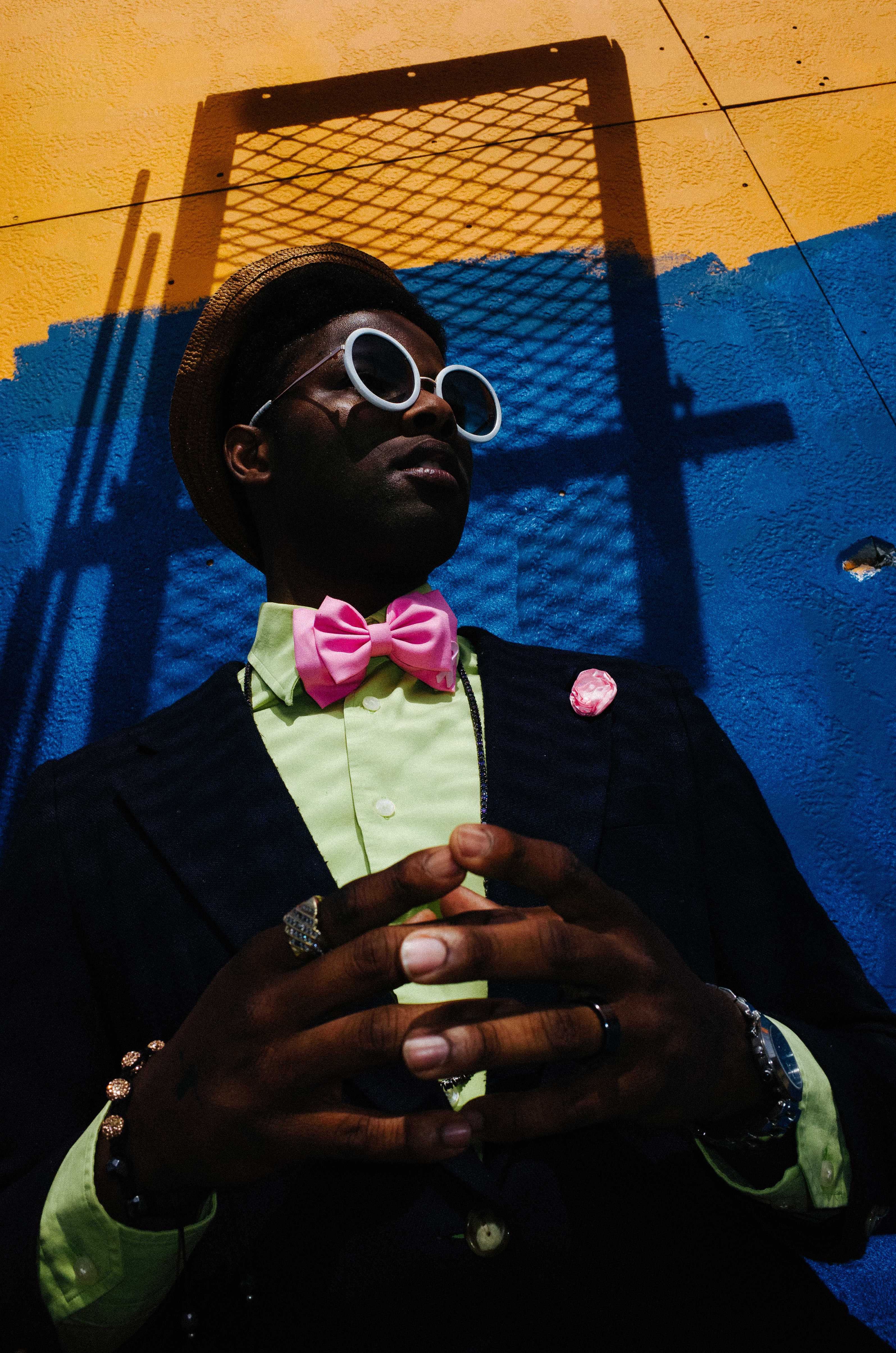
11. Start with a colorful background
One of the most practical tips I have in terms of shooting color is to start off with a colorful background, then figure out how you can add colorful subjects to your photo.
For this photo, during the middle of a workshop, my students and I saw an interesting guy in the streets of New Orleans. We complimented him on his outfit, and asked to make a few portraits of him. He was very open to the idea, so the first task was thinking to ourselves, “What is a good background?â€
I looked around, and found a simple blue background. We asked him to move in front of it. He had no problems.
Then you can see, I took a hell of a lot photos (112 photos in total). When you see a great subject, and they are willing to pose for you, try to work the scene as long as you can.

From shots 1-52, I got a bit tunnel-visioned, just photographing the subject against the blue wall. By shot 53, I realized there was some nice orange at the background, so I took a step back, and tried to incorporate the orange color as well (which is a lovely contrast to the blue).

The lesson here: start with a colorful background, and then figure out how to combine the different colors in your frame. Here I love the blue/orange background, and the man’s pink/green outfit. The “cherry on top†is his hands put together.
Color assignments

I hope that this very brief primer to color photography is helpful to you. Some assignments for shooting in color:
- Look for color when you’re out shooting: This will train your eyes to see the world in color.
-
Play with color combinations: Experiment by contrasting warm colors (red, orange, yellow) with cool colors (blue, green, purple).
-
Commit to color: Don’t decide whether a photo works better in color or black and white after you’ve shot it.
-
Determine your color palette before you shoot: Do you want high-contrasty, saturated colors? Or a more muted color palette to show a sense of nostalgia and timelessness?
-
Experiment with flash: I’ve personally found that shooting with a flash has added a new dimension to my color photos. Try shooting with flash and without a flash, and see how it affects your photos.
Remember, there are no rules to shooting color. Paint your own world.

Learn more
As a counter-balance, check out “Monochrome Manual“
To learn more, see all books >