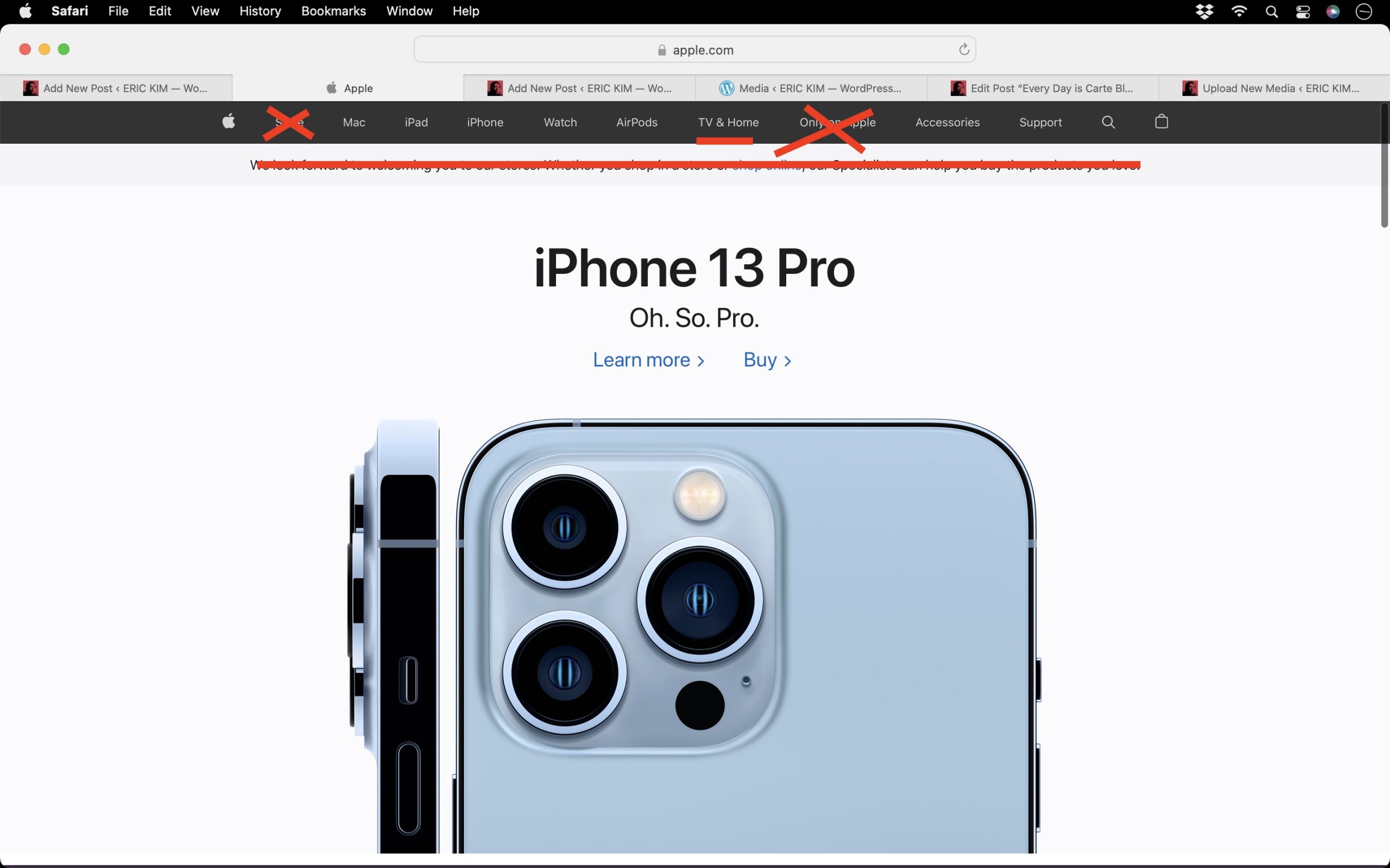
Why is the new Apple website so cluttered? Simple ideas:
- Get rid of these confusing links like ‘Store‘, ‘Only on Apple‘ (it should just say “Services” or “Subscribe”) and instead of ‘Tv & Home“, it should just be “TV”.
- Also the banner on top is unnecessary and ugly. Just get rid of it.
Otherwise the website is very good.