How to design a better UI/UX for iPhone Pro:
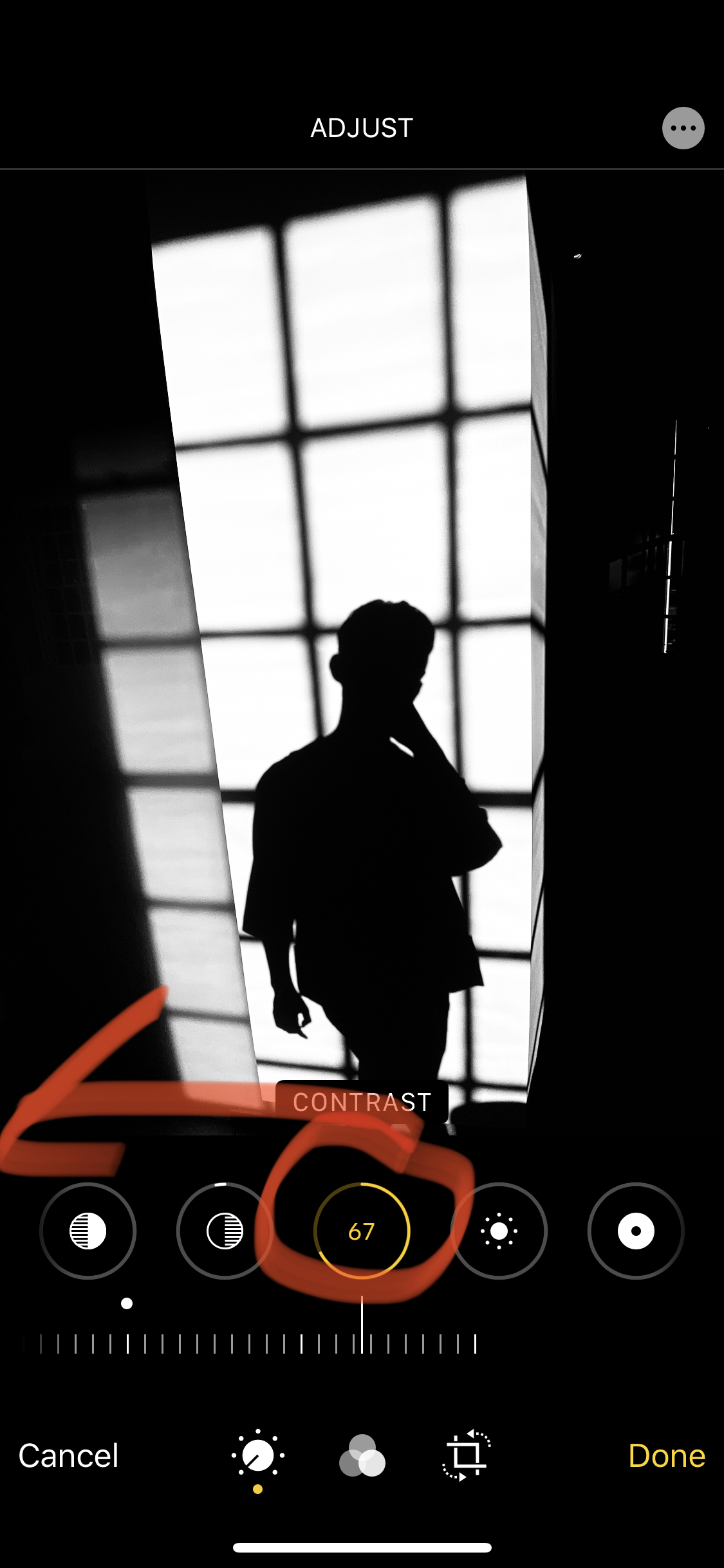
- With processing photos, make “contrastâ€one of the earlier options. Highlights and shadows should be added after contrast.
- When shooting with the normal camera, better to NOT show what’s outside the frame. It’s distracting and confusing.
- For the “noirâ€black and white setting, increase the filter intensity. Make it hyper “crushed blacksâ€and contrast (study the RICOH GR III with high contrast black and white as comparison).
- The night mode is confusing as hell. Better to just make it default on when it’s very dark.
- Changing aspect ratio seems silly. Get rid of the other aspect ratio settings. If people really want square they can do it later in Instagram, or crop later with default Apple photos app.
- Simplify flash setting: Flash as a toggle— either on or off.


