As a photographer you got a trillion things to shoot.
Question — what should I photograph? Meaning — Are there certain subject matter which is more interesting or less interesting to photograph? Are there certain things you shouldn’t photograph?
1. Photo everything
First idea: allow yourself to photograph everything.

I’m starting to think that all subject-matter is equal. Ultimately you are the judge.
Also the tricky thing with photography:
The act of shooting photos and the act of judging your photos after the fact is different.
Which means when you’re shooting, you have no idea how your photos will turn out.
Thus the first principle:
When in doubt, just shoot it.
2. Vegetables and food

A recent discovery — shooting vegetables, fruit, and food make interesting images.
The textures are interesting, and on leafy greens, the veins grow in a “fractal†pattern (like trees).


3. Photograph meals with loved ones
Photograph your food and loved ones.

Eating with Cindy at an outdoor taqueria in SoCal, and photos of her squeezing limes into the food.


4. Geometry
Photograph your subjects with geometric backgrounds:


Now the tricky question — which of these two photos are “better�
First of all, you can keep both shots and make it into a “diptychâ€â€” two images side by side, to tell a “visual storyâ€.
Or if you want to just choose one picture, let’s break down the composition.

Is it better to have a subject entering or exiting the frame?

Top picture has a good polygon shape 


The top photo has a more ideal geometry. The bottom image gets cut off.
Let us break this down some more, this time with individual images:


If we follow the geometric shapes as vectors, you can see the angle of the first shot is not as wide as the second shot.
In terms of shapes, which shape is more pleasing to you? The magenta or cyan?


Or


5. Gaussian blur and inverse
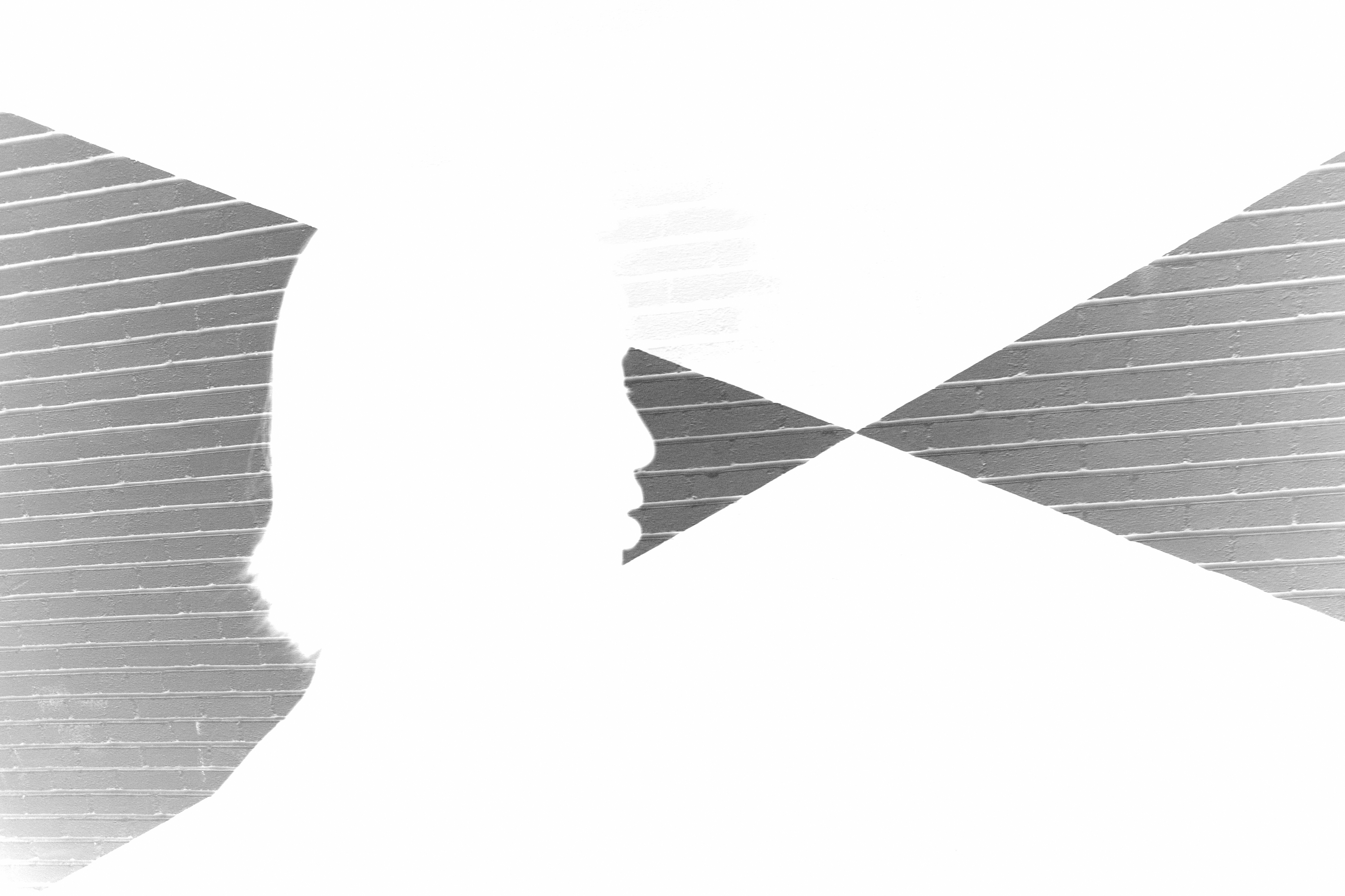
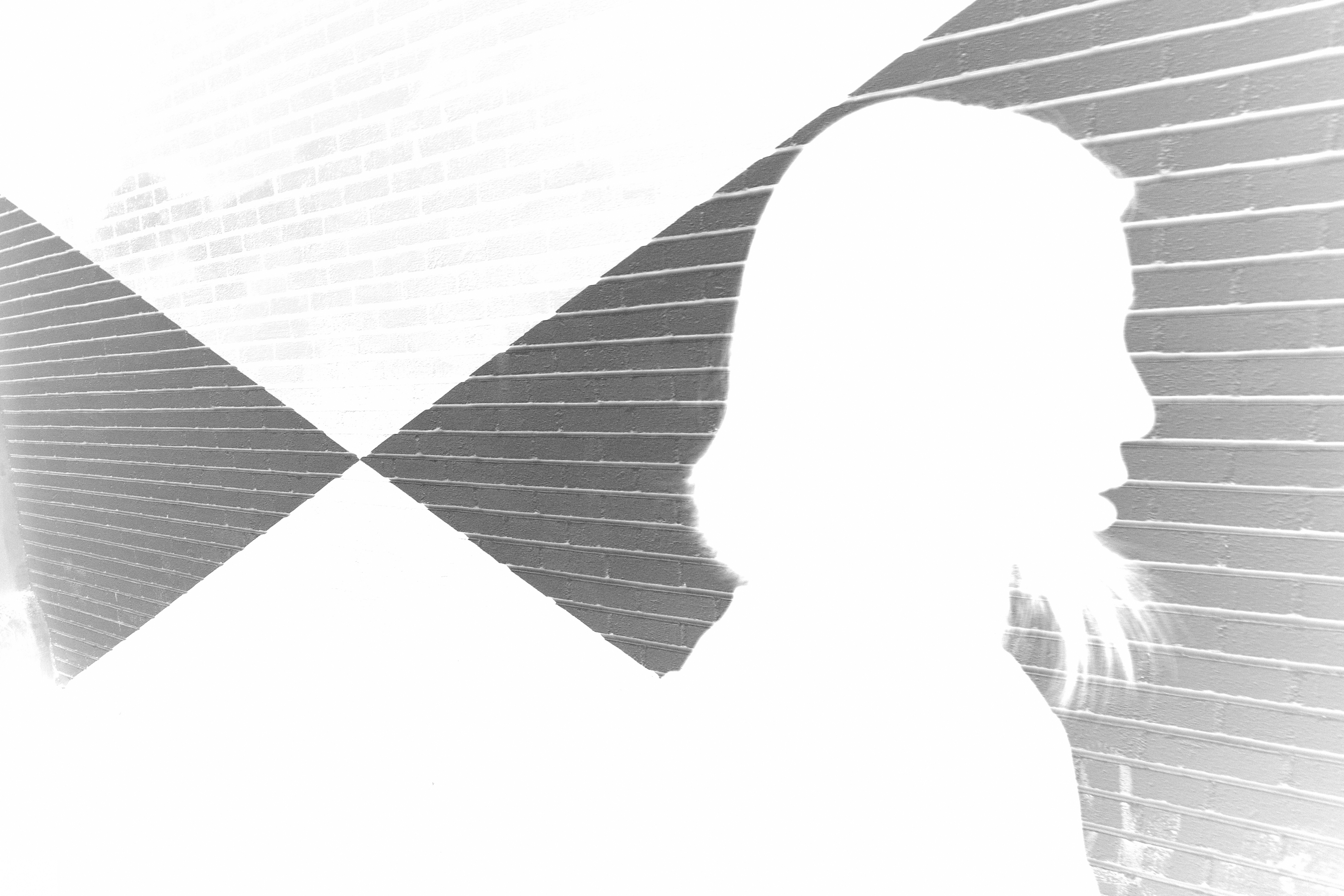
Let us apply Gaussian Blur and inverse the photo to find out more:


It looks like Cindy is entering this prism, about to get sucked into the light ray.


Inverse and Gaussian blur, we get a better sense of the details and edges. Note the horizontal lines in the background wall.
For the second photo, she emerges out of the prism. There is better separation between Cindy and the geometric shape in the background.
6. Filling in the images

In the first photo, There isn’t separation between Cindy and the geometric shape. Her face is integrated into it.


In the second photo, see how there is more separation of Cindy (magenta) from the geometric shape (cyan):


Animated GIF:

Conclusion

Shoot anything you want. And then determine after which photo you like the best.
If you need help getting constructive feedback to your photos, share them to arsbeta.com for honest critiques.
Make on!
ERIC


