
Okay friend, to start off– realize as a photographer, you already are an artist! Don’t let nobody else tell you otherwise.
Anyways, now that we got that out of the picture– let’s talk on how you can see the world like an ‘artist.’
1. Shapes and forms

I’ve been studying a lot of graphic design (rectangles and triangles) and I feel like I’ve been seeing the world from a photo-cubist perspective.

I don’t take drugs (only caffeine), but I feel like I can see the world like Picasso. I see the world as a geometric one.

I’ve achieved this by starting to trace a lot of Picasso and other cubist painters. I started to see diagonals everywhere– cubes everywhere, triangles, and started to simplify reality.

A simple tip I have applied to my photos: connect the diagonals to the edges of your frame.


For example, let’s say this is your viewfinder:

Try to create compositions where the diagonals come from the top-left, top-right, bottom-left, or bottom-right of your frame:


A simple way you can start to see the world more geometrically is to print out cubist pictures you like, and just trace them with a red pen or marker. Or do it digitally like me — use an iPad, buy the ProCreate app, make layers, and trace images you like.
2. Try to ‘glitch’ reality (SURREALISM)

Normal straight-on reality is boring. Rather, try to ‘glitch’ reality — by fucking with it.

For example, ways we can ‘glitch’ reality:
- Adding blur to our photos
- Tilting our camera and horizon (DUTCH ANGLE)
- Using a flash
- Photographing reflections, mirrors, shadows

Essentially, you are trying to create your own version of reality. You are trying to confuse your viewer– by making surreal images.

Surrealism: pictures that don’t look real.

Reality is boring.

To find more inspiration for surrealism, study Salvador Dali — the ultimate, and in my opinion, the only ‘true’ surrealist who has ever lived.
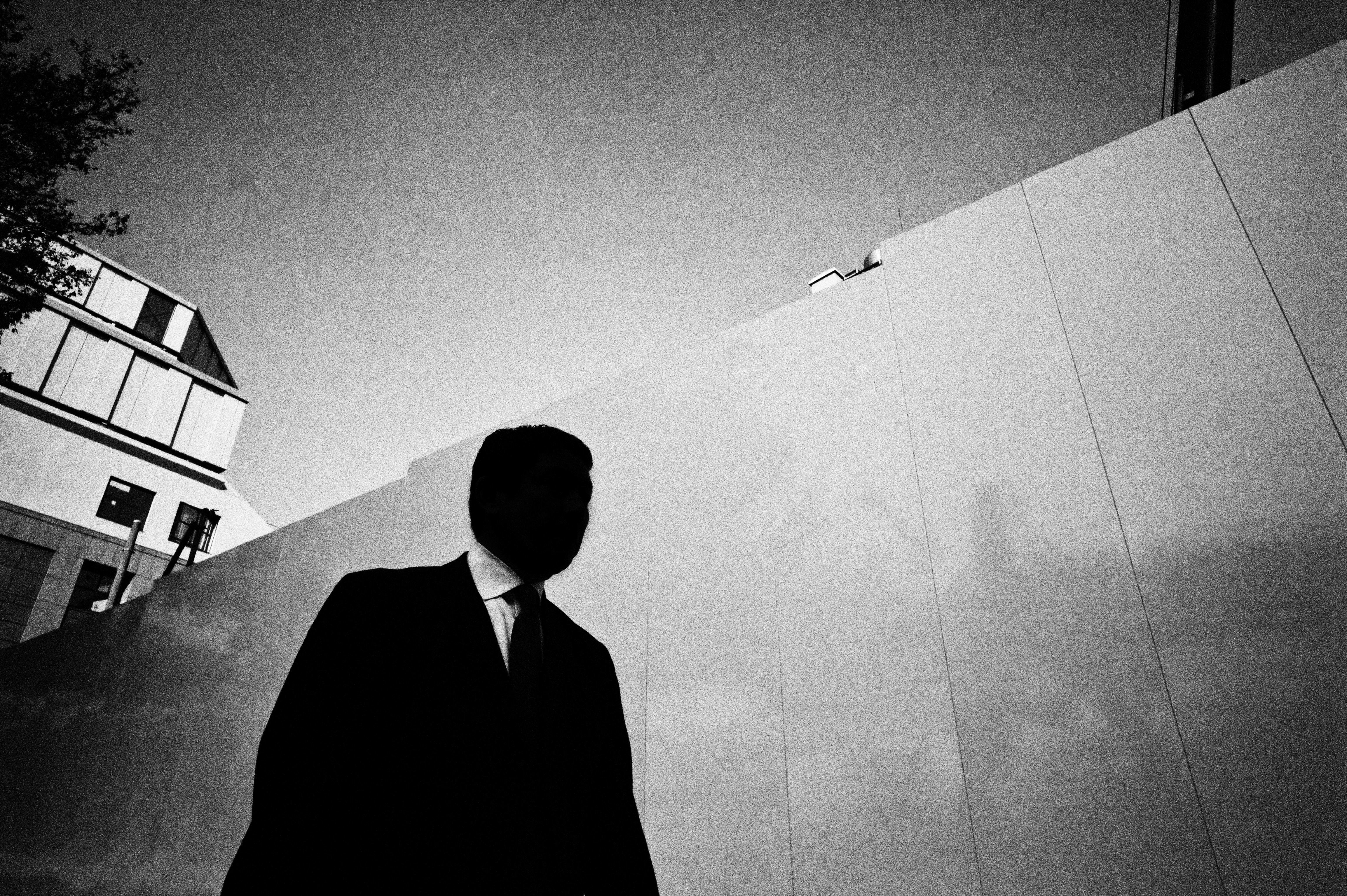
3. See the world with brightness, tonal values, and ‘VALUE’

There is an art school word called: “VALUE”. Essentially it denotes the brightness or the intensity of a color.
For example, easiest way to study ‘value’ is to shoot black and white.
Imagine if you had a spectrum of black vs white:

[PITCH BLACK]-[DARK BLACK]-[DARK GREY]-[50%GREY]-[LIGHT GREY]-[OFF-WHITE]-[PURE WHITE]
However ‘dark’ or ‘bright’ it is, that determines the ‘value.’
Why is ‘value’ important to us?
Well, whatever has the ‘brightest VALUE’ in a picture is what directs our eyes. Or the area with the highest contrast.


For example, if you have a black background, whatever is PURE WHITE in your frame is gonna get the most attention from your viewer. The viewer is gonna look at the WHITE OBJECT the most in your frame. Why? Because it draws our eyes the most. Then, they will look at the slightly less bright object, like the grey object– with a lighter ‘value.’


Or if you inverse it– if you have a white background, you will first look at the blackest object (has the most contrast), then you will look at the darker colors afterwards.

How to apply this theory of ‘value’ to your pictures
I recommend to shoot black and white to start off with basics studying the ‘value’ (brightness) of light.
Some simple techniques to use:
- Use a flash: If your subject is close to you, use a flash. It will brighten them, and therefore everything in the background will look darker (by comparison). Therefore, the viewer knows to directly look at your subject (who is shot with a flash).
- Dodge & Burn: Use Lightroom’s ‘Adjustment brush’ (or any dodge and burn tool) to brighten and darken parts of the picture, to draw the attention of the viewer to certain parts of your picture. To ‘Dodge’ means to brighten. To ‘Burn’ means to darken. And no, this is not ‘cheating.’ So brighten the faces of your subjects, and darken distracting elements. Also do this with finesse– too much brightening or darkening will make your photos look ‘fake’ and aesthetically ugly. Just follow your gut.
- Start with a simple background: Start with a black background, a white background, or grey background– and experiment by adding different elements to your picture. This will create a stronger ‘Contrast’ or ‘Figure-to-ground‘ in your pictures.

Here are some more examples of strong white against black figures to get your mind flowing:


Conclusion

Here are just some simple ways to see the world like an artist.
The best tip I have for you:
Don’t just think of yourself as a photographer, but as an ‘artist’.

Don’t be pretentious about it. We are ALL ARTISTS (if we like to make stuff). All children are born as artists. The problem is as we grow older, we get the inner-artist beaten out of us– by society, parents, families, schools, and authority-figures telling us what NOT to do. Telling us to shut the fuck up, sit down, and be a good student, and follow the rules.


To be a true artist is to awaken the inner-child in you. To NOT listen to rules, guidelines, or anyone else.


Unleash the inner-artist, the inner-visual beast within you!
Have fun, and BE CREATIVE EVERYDAY!
ERIC
MASTERS First Edition Book

MASTERS Volume I is your essential photography primer– to push your photography education to the next level.
To learn more, START HERE.