
(Cover Photo by Bruno Cunha)
Complementary Colors is a tricky thing to pull off since you need to have that mental color wheel in your head and at the same time, making sure you have a strong point of interest in your composition. Weather also needs to be in your side to pull off those nice contrasty colors that will make your Complementary Color stand out. Despite those challenges, I think this group of images pulled it off!
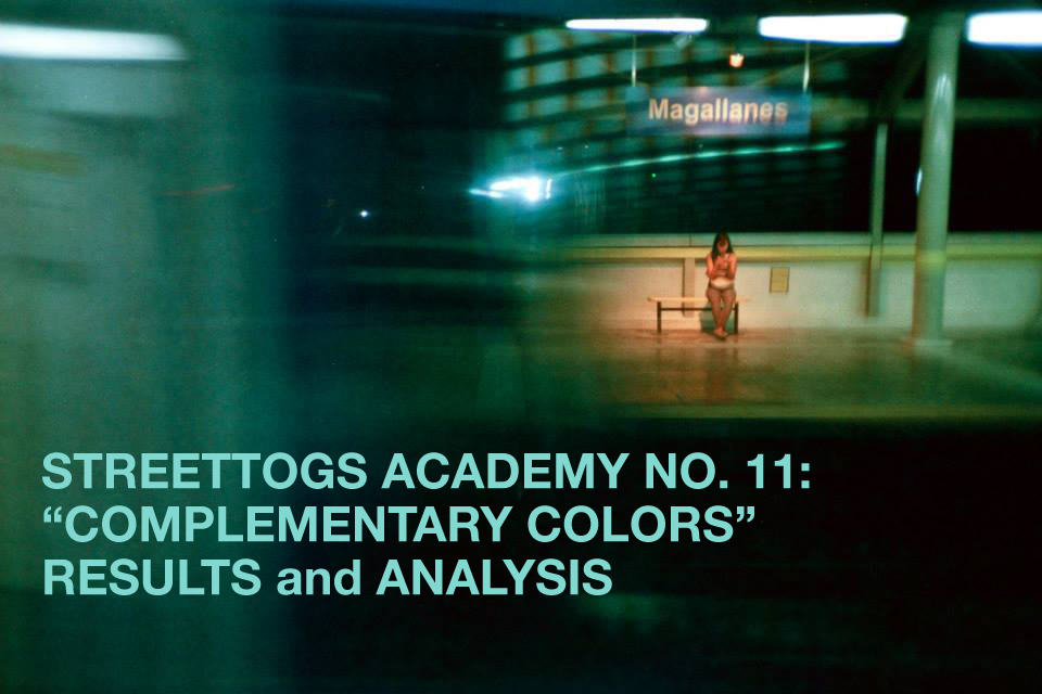
Here’s the latest results and Analysis for Complementary Colors!

Let’s start off with the person that came off with our Assignment, Monika. Of course what stands out is the colors Red and Blue and figures on the opposite ends of the frame. In the image, the entire tone is on the cool side so having things opposite that such as the reds make the color stand out. It also helps that the background is a sort of stone marble that mutes the reflections thus making the girl in polka dot stand out more.

If in Monika’s picture the background is muted, for Stefano, it is just an explosion. Perhaps this images is more appropriate if the theme is Color Explosion that Complementary Colors. Nonetheless, note the patterns for this one. On the wall is vertical patterns while on the shirt it is horizontal stripes. It works because the subject is placed on probably the biggest empty space in the background making her stand out and break the rhythm of the background.

Correct me if I’m wrong but I think this is the first time that in the analysis part, the two entries got in by the same person! Special kudos should go to Stefano for nailing this assignment!
Severed limbs maybe a cliche nowadays but pay attention on the alignment and the color of the sleeves. Personally, had that alignment been off or the colors been different, this wouldn’t have worked. Also note that in the entire frame, there’s only 2 dominant colors (blue and orange that complement) and 2 neutral shades (black and white). Great work from Stefano in this one.

Here’s another take by Leonardo regarding backgrounds. Having that bright yellow background then complemented by that blue ball and the clothes of the girls make them stand out as subjects. Always remember, simple always work.

Luck is on Harry’s side on this photo. This one deceptively looks like one of those cheesy selective color photographs but if you look closely, it’s all about light and creative exposure. This method made made the blues pop up which directly complemented the yellow frame the main subject is carrying. Extra touch to the woman in the background.

Let’s keep the blue and yellow coming along with this photo by Bruno. It is simple but sometimes, simple just works. The blue jeans and blue barrels vis a vis yellow shirt, sneakers, and wall. Do note that I like the balance in the frame with the shadow of the subject and the barrels together with the white tissues on the left side. It’s for those reasons that Bruno got the pick as community’s choice! (and thus the cover for this assignment, it’s a new thing we’re trying out)

Here’s another bit of complimentary blue and yellow but let’s add a new concept into the fray. By having the shade of red in the foreground and the hat of the security being red, it creates a good harmony because red goes well with yellow but the blue adds that little extra to the image. The key is to not get too obsessed with color theory and just get the right moment with the right colors like what Fabricio did here.

When you have good light, you are going to have a good time. Jomel’s photo benefitted from this good light. Blue hour and yellow to orange shade shirt fulfills the assignment but it’s the cross and the nice highlight it has makes it stand out. Sometimes, try position yourself so that you will get those highlights ala studio made hair lights on your subject/s just to give that extra pop on the frame. Really works well for Jomel’s shot.

Alexander here has perfect geometry. Blue and orange is your complementary color here but the star of the shot is how the bed (or futon/mattress) aligns perfectly with the lines of the orange fences. I do like to note as well that the background maybe a bit cluttered but his foreground is clean that still shows cohesion in the frame.

More often than not, architecture use complementary colors to make their buildings stand out. Its sets like these that street photographers can exploit with an amazing light or a simple figure across the frame just like what Hilden did here. It’s very simple and clean that you know what you are looking at already.

Brendan gave a bit of throwback to our 1st Assignment, Squares. I’ve always espoused here in SA that frame within a frame works great and simple to pull off. The story in the frame is quite interesting as well. The light is green but sign says slow, however, no cars are around! It is quite funny and fulfills the criteria for our assignment.

A good complementary to blue is orange which can be clearly seen here in Kevin’s image but what takes the cake for this one is his silhouette work. The geometry of his image seem to work well in the entire frame. The feel of the image throws back to slide film as the colors are popped but not exaggerated. Truly one of the best in the group and one of my personal favorites so far.

Following from the combo of blue and orange is Matteo’s shot right here. Again, framing her subject in the window and what a great serendipity this is. How many times are you going to encounter a person who has the same shade of color as the wall she is in that also complements the view? Wether it is by patience or happenstance, it is things like this that a street photographer shouldn’t pass by.

The thing that I like about color is when subjects tend to represent the color of the clothes they are wearing. The sign means no parking for cars but the man casually parks himself in front of the green gate to take a nap. His red shirt make him stand out from the green gate and as we know, red is a color that symbolizes rebellion or subversion. Smart juxtaposition always make good street photographs.
Editor’s choice
Color has always got a bad rap in the world of photography. During the 70’s, its reputation is stuck in the world of kitsch and tacky as it has been the preference of advertising and other elements of pop culture. Thankfully, artists like Eggleston, Meyerowtiz, Goldin, Parr, and many others have shown us that color can create mood and evoke emotions in the same manner as black and white. Color images give accuracy about the world around us that shows the descriptive power of photography. The fact that there exist a color theory on things like complementary colors or analogous colors means that it can be utilized for artists to use. The images on this assignment reminds us that color is not just about the color of the shirt or the color of the architecture, it can be used to tell the story itself.
The best photo which told the best story is this one:
Congratulations to Kevin Weinstein!
Email me at contact@agdemesaphoto.com and let’s talk shop about what we are going to give the group as a next assignment!
Honorable Mentions
Alexander Graah
Bruno Cunha (Community’s Choice!)
Closing Thoughts
Assignment no. 12 will mark the 1st year of Streettogs Academy! As such, we are switching stuff here and there while constantly experimenting on how to best become a great platform for understanding street photography.
If you want to join in, just go to the Streettogs Academy Facebook Group! (or read my introduction here)
In behalf of your moderator, Fabricio Santos, we would like to thank you for participating in this’s assignment and hope you will joing again in the next one!
Cheers!