

Eric’s Note: CritiqueMe is an on-going street photography critique series by Ollie Gapper, a street photographer based in the UK.
Ollie: For this weeks CritiqueMe I chose to comb through the work of prolific Tweeter, Gustavo Mondragon. I was sucked into the portrayla of life Mondragon presents from his hometown of Mexico City. I always find it interesting to see, not only different lifestyles, but those lifestyles presented by someone who actually lives them.
Heres a brief Bio by the man himself:
“Born and raised in Mexico City. I started to get more serious in photography, around 1996, at first I bought books to learn the craft, and books to see the art. Then, as I had time in the afternoons I enrolled in one of the most known photography schools in Mexico City. With time this hobby became an infatuation until the kids arrived at my house and my wife and I had to change priorities and left a side the shooting, again a hobby. Now, the kids have grown (8 and 5) and I can return to my passion and keep developing my craft.
I have learned of a lot from people like Erik Kim, Thomas Leuthard, Alex Coghe, who with their blogs spread the art around, for this I thank you.
I love street photography and respect a lot all the photographer that go so close in to shoot their subject, but for me, Street photography is not so close in, although sometimes I have to do it, I prefer a street photo from a little further.
Photography helps me to have order and meaning in my life, without it I am a lost dog.”

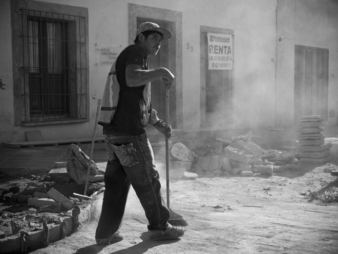
This image works fantastically due to a couple of crucial factors. The dust and smoke being kicked up from the background gives a feeling of movement, drama and help separate the central subject from his surroundings. The exposure allows the highlight on the subjects face to stand out just enough so as to not blow out, but to just outline the subject, again allowing for a separation and visual hierarchy causing the scene to be dominated by the powerful worker. The composition is on of the only areas of this image that I would like to approach differently. I would like to have seen more of a righthand weight to this image, possibly framing the subject further the the left third of the frame, creating a more pleasing and flowing composition.

This is an image that works great for what its trying to say, its not an image that is simply poking fun at society, rather critiquing it. I can see from the title you gave the file “Double Reading” that you wanted to show the two men, almost polar opposites in terms of lifestyle, clothing, etc, sharing a common ground, but for me the image doesn’t quite show this due to the relative importance you have given the show polisher and closest man in relation to the other man having his shoes shined. For me, when I look at this image, I see a man having his shoes shined, but not wanting to see the man who is serving him. Its almost as if he is ashamed to be on the pedestal, as if he feels hypocritical (he looks like someone who may have worked that job in his past, or a similar job of graft). This image does have a visual aesthetic that reminds me of Lee Friedlander, with the composition cut and chopped numerous times throughout the frame, never truly allowing the audience the chance to rest their eyes anywhere in the composition. Your exposure again is perfect, with a full range of tones and highlights just where they should be.

This image has shadow/highlight or tone mapping aesthetics that verge on killing the photograph, yet they don’t. Its so close to being an obvious HDR for the sake of being a HDR (which I dislike with a rather strong passion) but it is just within the threshold of being acceptably non-HDR (in my eyes). The range of tones is great, and acts as a real treat for the eye – I find my self feeling greedy, relentlessly scouring every inch of the image to try and gather as much information about the scene as possible – which we can thanks to your excellent exposure (again) and choice of aperture. The nitty-gritty details become so important in this image, I find my opinion and view of the subject being formed not so much through his appearance or pose, but through his surroundings. I would have like to have seen a lighter tone of grey on the subjects face, to give him more of a presence in the image but i personally feel that your exposure is spot on, so other than using a flash (why not try?) I can see no way of really overcoming this.

This image is an image of unease – disequilibrium even. It shows for me that tense moment after being spotted taking a street photograph where the situation goes one of two ways, either he smiles and we all go back to work, or we face confrontation and the pre-recorded excuses and get out of jail free cards come into use. The proximity you have with your subject is so intimate and personal that its hard to relax when looking at the image, which is good as through this we notice the secondary element of the image, the man in the background who looks as if he is wearing skeleton makeup or something that makes his face out of the ordinary – a perfect jux-ta-position to his mundane body and posture. Your composition allows us into the scene and grants us knowledge of all that is happening in it (apart from the man in the background) which really helps secure an audiences position in the image, and through having the man standing in the background the image avoids being boring and instantly readable. The best street photographs ask more questions than it answers.

I must say, I really do see a lot of Friedlander style compositions running through your work, its a wonderful style that is hard to pull off but incredible when done right! This image is so full of captivating elements for the audience to study and read. First is the obvious central subject, propped casually against his wagon, then we have the female behind giving that intimate stare into what looks like our protagonists face (excellent choice of depth of field by the way), then the old lady wrapped up in her wheelchair waiting to be served in the background. Its a visual feast for the audience, with just one snag – the horizon. Now I know that having a straight horizon isn’t always important nor suitable for some images, but the tilt here just seems to be a bit too much. It begins taking over the image, making it hard for me to truly immerse myself in the scene. Having no tilt wouldn’t have worked either though, I see that we really do need some movement to the framing to visually rhyme with the messy and disorganised stall in the foreground, but too much and the image becomes uneasy, as is the case here. In terms of exposure, im splitting hairs here but it looks to me to be about 2-3 tenths of a stop dark, the highlights just need an extra ‘pop’ that the rest of your images exhibit so beautifully.

This final image again transimts to me that feeling of unease in waiting for a reaction after getting caught. The subjects face (especially the moustache!) looks fantastically timeless, its an image that seems to be full of Mexican clichés yet its not too “obvious”. From the proletariat car in the background to the clothing of our subject to the job he is doing, the image really makes me feel as though I am there. I can feel the heat and smell the meat (completely intentional poetry there) a really great image. The only point I would like to make here is that it seems to me like you’re deadly scared of blowing a single highlight. Yes, detail is good, but sometimes an image just looks better with a few rules broken, some highlights lost, some shadows thicker than they should be, a wonky horizon here or there, sometimes imperfections should be embraced and utilised. Id like to see this image puched up about 1 and a half to 2 whole stops, allowing the background to blow just a bit, and pushing some of the highlights onto our subject.
From studying these images along with some more of your work, Gustavo, I can see you’re pulled to the working man. Its a noble motivation, to want to document them and what you do, and doing so in a way that is not cruel, but not glorifying – you have achieved a great balance. I would love to see what you could create with some much older gear, something like a Leica iiif or Zorki 1, loaded with some HP5 pushed to 3200, so you are forced to make use of and embrace the inherent imperfection and limitation of your gear, rather than avoiding them – which will make you a stronger photographer when you come to using a more refined camera. Perhaps even something like a Zenit E or FT N would work, it doesnt really matter, I would just look for tan old, crappy/tatty (I’m in no way calling the aforementioned cameras crappy, I lust over them on a daily basis (apart from the Zenit, that is a POS)) camera that pushes you to taking images in ways you would never have dreamed before.
Ill be making Gustavo a print of his chosen image “Iron Horse” – a truly fantastic image that I cannot wait to see printed. Remember, if you get chosen for critique, you’ll also receive one of your prints professionally printed by myself and a highly trained technician from a fully colour controlled print lab at my university (no, not boots or costco), along with a mystery image of mine, signed and dated on verso!

Thanks for all your entries, keep them coming! (please remember, one link maximum per email (olliegapper@me.com), I prefer if the images are sent as an attachment or organised on a singular webpage).
Heres Gustavos fantastic 500px site, definately worth a look!
On a side note, David Gibsons street workshops in London this february are now sold out (I look forward to seeing those lucky enough to land a place there!) but he has opened up for a second workshop weekend on the 3rd/4th of march, get in touch using these links:
http://www.facebook.com/DavidGibsonStreetPhotographyWorkshops
http://www.gibsonstreet.com
Follow Ollie
What do you think of Gustavo’s work? Leave a comment below and let us know your feedback!