Your cart is currently empty!
Basic Composition
Dear friend; I want to give you some basic photography composition tips:
1. Triangles and Diagonals
First of all, to make stronger compositions, look for diagonals and triangles.
Enough diagonals in a frame; you will make a triangle.
Not only that, but the triangle doesn’t need to be perfect. As long as the triangle is dynamic — and has lots of diagonal lines. This composition is more edgy, dynamic, and more interesting.
I also think that sometimes you see the triangles/diagonals while you’re shooting. Sometimes you notice afterwards. It doesn’t really matter — as long as you are able to identify your strong compositions and strong photos (when you’re looking at your photos).
As an example, note this photograph I shot in Kyoto. I was walking by the river in Kyoto with my buddy Sean, and I shot some ‘selfies’ of myself, from all these different angles. I think I shot around 30-40 photos of the scene.
When I was making the photos; I tried to constantly simplify the scene. Note how I tried to tilt the camera (like ‘dutch angle’) to get more dynamic lines and triangles, and diagonals in the frame:


Another example is in this photo of Cindy.
The story is that I was having a cup of tea at our apartment in Berkeley. Nice sunset, and light streaming through the living room. Cindy was chilling on the couch, and I saw the light, and went over and tried to make a photo of her and a selfie of myself (on the right).
She said the light was bright; and held up her hand. And that is what makes the shot– you can see her hand (looks like a triangle). Also there is a triangle and diagonal in her arm gesture:


So the practical takeaway point with triangles and diagonals:
Assignment 1: Look for triangles and diagonals
Identify triangles and diagonals when you’re shooting. If you don’t see them, create them. Tilt your camera, and connect diagonal edges to the edges of your frame.
2. Fibonacci spiral
I don’t think anyone can see a fibonacci spiral when they’re out walking. But, we can look for curves.
Here is a photo I made (of another photo). Note the curve, the dynamism of the movement in the shell. And how a lot of industrial design (like car rims) are inspired by nature:


One of the best tips I have is to use Lightroom, and access the Fibonacci Spiral overlay in Lightroom:

I Instructions: First open up Lightroom:
- Press “D” to go to ‘Develop’
- Press “R” to go into ‘Crop’ mode
- Press “O” to change the ‘Overlay’ (press this several times)
- Press “Shift+O” to change the direction of the overlay
See if your photos fit the fibonacci spiral, and study your compositions:

For fun, I apply the fibonacci spiral to photos that I like in terms of composition.
The reason I do this is because I want to see whether my compositions fit the ‘rules’ of composition. Often they don’t. Sometimes they do.
I do find the fibonacci spiral is good because it create a harmony of proportions to your photograph. It achieves good balance.
Not only that, but nothing in nature is straight. Everything is slightly bent, or curved.
Curves are more dynamic than horizontal, vertical, or even diagonal lines. So thinking about the fibonacci spiral in the back of my head encourages me to think about curves, to make better compositions.
Assignment 2: Wait for someone to enter your spiral
One of the practical ways to apply a fibonacci spiral to your photos is this: identify a good scene (with a spiral), then wait for the right people to enter the frame.
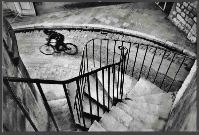
For example, this is one of Henri Cartier-Bresson’s famous ‘bicycle’ photos:

What I guess is this: Henri Cartier-Bresson saw the composition, waited, and a bicycle came into the frame. It fits the fibonacci spiral quite well:
A way I applied this technique: I saw a good curved staircase, and waited for someone to enter the frame:

It fits the fibonacci spiral well, although not perfectly:

What I just think is more important is this: the curve leads the viewer’s eye, and having the dark subject against a white background, gives the image visual harmony:

So be patient, like a good fisherman; and wait for your fish to come to you.