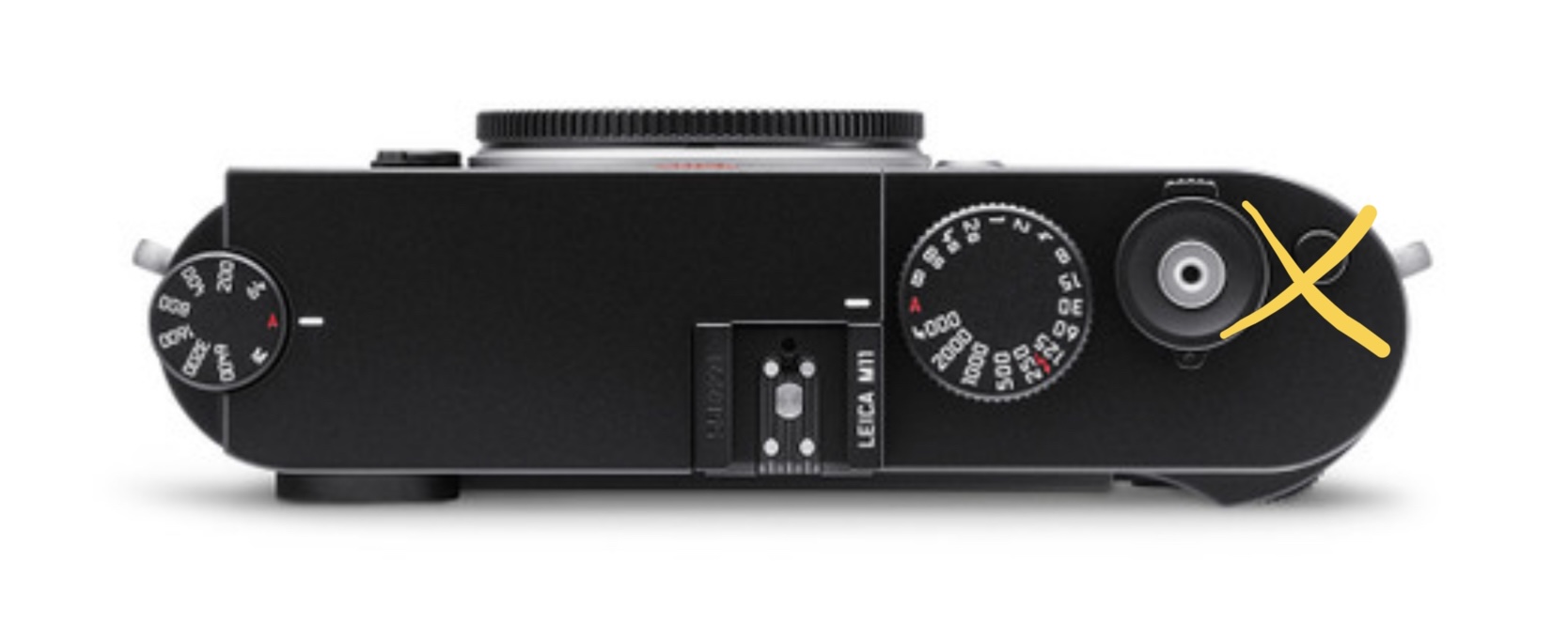
Some design suggestions for the Leica M12:
True minimalism

The first design suggestion is this: become more ruthless about transforming the new like a M digital camera into minimalist perfection.
Get rid of the things that nobody uses
For example, nobody uses that lever in the front of the Leica M rangefinder camera.


Also, get rid of the button in the top right corner of the Leica M rangefinder digital camera. nobody knows what that button is.
Differentiation?
The big problem about the new Leica M 11 is this; it is virtually undistinguishable from the prior generation Leica M 10. Therefore, it is my belief that there is no real strong incentive or motivation for photographers to either buy an M 11 over an M 10, or upgrade.
A simple suggestion is make the Leica M12 have an all black dot, with the “Leica†script in white. At least superficially, it looks different.

